Since July, I’ve been learning more about Accessibility. I did two online courses and yesterday, I was at the Accessibility Scotland conference in Edinburgh (my first ever conference!) which I really enjoyed. So if you would like to learn more about it too (and really, everyone should) I thought I’d share my notes.
Online courses
I started with the new course on the Interaction Design Foundation which was really good, very detailed and covers a lot of aspects including coding advice, and VR for example.
Last month, I completed the Futurelearn one which you can do for free. It has very good personas helping you to understand everyday life difficulties and you can learn about the various technologies and tools available.
Accessibility Scotland
I see lots of UX conferences I’d love to attend, but it’s usually expensive. This one wasn’t (only £60) and not too far: perfect!
6 speakers, one workshop. I think it was a good format. You could submit ideas of workshops beforehand, vote on the day and pick one out of 6, I picked: “How to improve testing with users with accessibility issues”.
All the talks are available on video, and have a transcript:
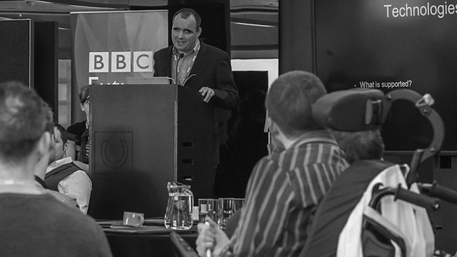
- Paul Bepey – Building end to end accessibility at the BBC
- Curt Holst – Accessibility and improved user experience for all
- Hampus Sethfors – Have you tried to dab some coconut oil on your spine?
- Vasilis Van Gemert – Exclusive design principles
- Phil Day – Accessibility of self-service technology
- Heather Burns – So long, farewell, auf wiedersehen, adieu: What Brexit means for accessibility and you and you and you
Curt Holst (Barclays) — Accessibility and improved User Experience for all
The slides of the presentation are available.
The World Health Organization defines disability as:
“a mismatch in interaction between the features of a person’s body and the features of the environment in which they live.”
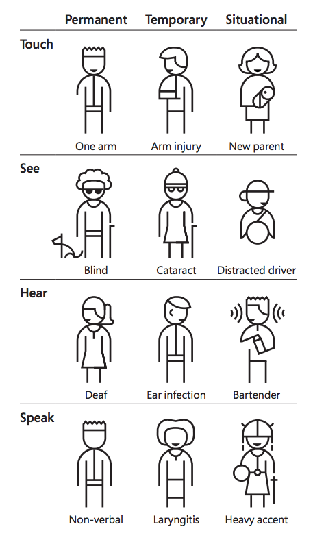
The impairment can be permanent, temporary or situational, but in the end, it’s the same requirements:
Five commons accessibility myths busted:
- my users don’t complain about accessibility so we must be doing ok → only 10% of the users complain
- accessibility is not my job → it’s everyone’s job
- fixing accessibility is expensive → if it’s done early it’s not expensive
- the market is just too small to justify all the time and effort → 12.9m in the UK and others will benefit
- accessible design means boring design → embracing accessibility can improve the design and the creativity
“Accessibility is a creative challenge, not a challenge to creativity”
More in this video:
Barclays has an Accessibility Academy: with videos, and other resources like Diverse personas, or training in empathy labs.
Recommendations:
- recognise bias
- consider accessibility early
- innovate from the edges
- humanise the stories
- accessibility is to be at the core of what you do, not something on a tick list
Paul Bepey — Building end to end accessibility at the BBC
The slides of the presentation are available.
Each project has design guidelines, but also assistive technologies guidelines. Users are included all along the project. They are put first and embedded in the process right from the start.
Some interesting links:
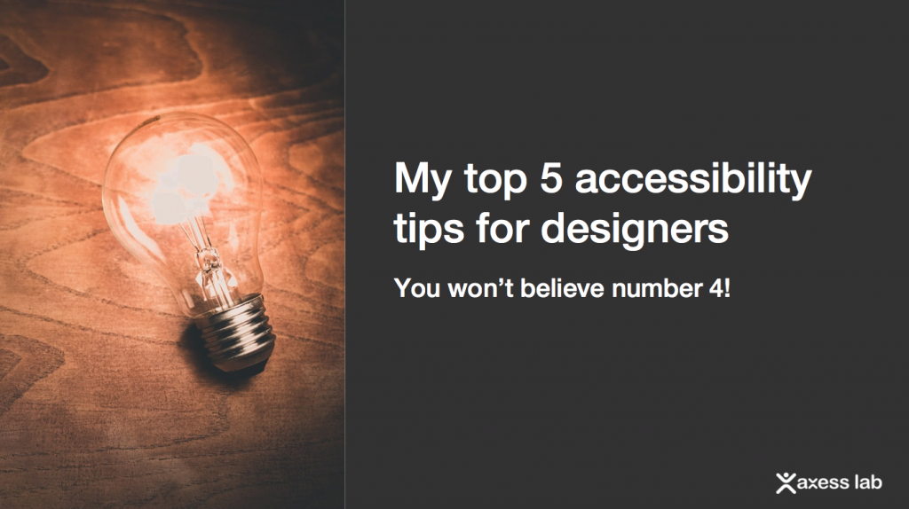
Hampus Sethfors (Axess lab) — Have you tried to dab some coconut oil on your spine?
Really interesting talk! The slides are here: https://axesslab.com/scotland
We learned that a11y is t12t in Swedish (for Tillgänglighet)and got stickers!
Tip#1 Focus on changing attitudes.
Tip#2 Focus less on WCAG: good as reference, but you need to start with the users and test with them, not simply tick the WCAG recommendation list.
Tip#3 Be careful with trends: thin grey fonts, white text on light colours or photos, parallax scrolls, but also some material design input field from Google.
Tip#4 Play with balloons! keep a balloon in the air while completing a task in an app using your phone. Constant distractions forces you to have a very simple and intuitive app if you are to succeed to use it under these conditions.
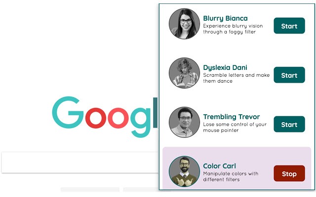
Tip#5 Empathy through simulation: use Funkify, a plug in which will help you understand how users see a page depending on various impairments.
Have a try, it’s a really good way to see how some users experience a website. My favourite one is Hyperactive Henny, when you get distracted by crunching noises, and pop ups.
Heather Burns — So long, farewell, Auf Wiedersehen, adieu: what Brexit means for accessibility and you and you and you
I didn’t take much notes unfortunately, the presentation was really good. She made the legal aspects very simple and clear, which was quite an achievement considering the subject.
The slides of the presentation are available.
Some links:
- Digital law and policy expertise | Heather Burns | webdevlaw.uk
- A plain English guide to the EU public sector accessibility directive – WebDevLaw
- UK tech policy after Brexit
Phil Day (who presented instead of Elina Jokisuu) from NCR — Accessibility of self-service technology = Accessibility for anyone, anywhere, anytime
Again — no notes, sorry. Interesting talk about the challenges of making ATM, and self checkout machines work for everyone.
The slides of the presentation are available.
Vasilis Van Gemert — Exclusive Design Principles
The slides of the presentation are available
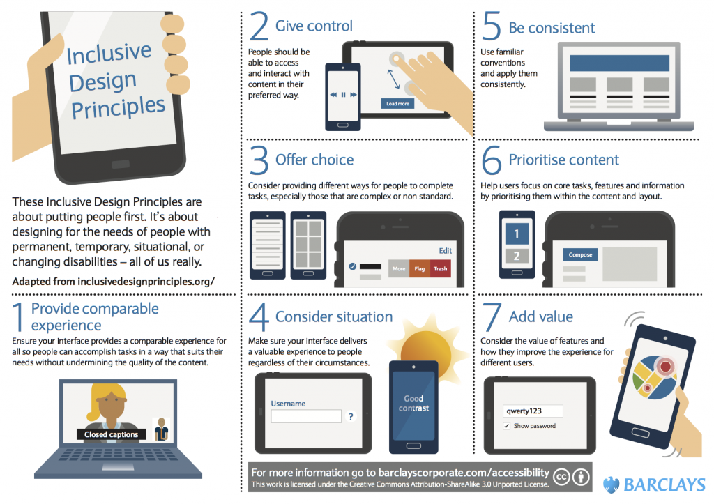
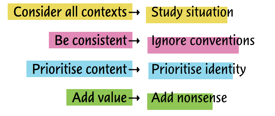
This was the last talk, and it gave me a lot to think about as it was challenging some of the things we had seen during the day. He likes to flip principles and see what happen. So taking 4 of the Inclusive Design Principles from the Pacielo group, here is what it becomes once flipped:
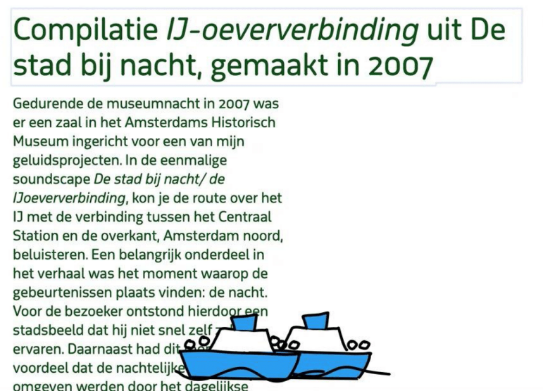
The last one was the best one as this led to creating visual animations on the website of a blind designer where the screen readers would make funny noises or laugh. For example, there were two boats on the page, moving over the text and when they reached the edge of the page, the screenreader would say: “boing! boing!”
Some links:
- Design like it’s 1999 🔎 Vasilis van Gemert’s Research Blog
- Turning the Inclusive Design Principles into the Exclusive Design Principles
- Tool and Examples
The workshop: “How to improve testing with users with accessibility issues”
A lot of interesting discussions. Notes from all 6 workshops will be available later on Accessibility Scotland website.
Here are mine:
- learn the specific language and terms your user group might use beforehand, and learn about their problems/condition
- advocacy groups are usually better than charities as point of contact
- it’s better to see the user in their own house using their own assistive devices
- when possible, join an event held by the group, that way it feels like you’re a guest (more natural)
- it’s interesting to see a group instead of an individual as discussions arise between them and add value to your research: they might not have mentionned this in a one to one situation
- beware of professional testers: when you get your users via a recruiter, some might be doing a lot of testing and most of them have good digital skills, this won’t always be a good representation of the reality
- some automatic Accessibility checkers were mentioned like Wave and Axe
And finally, one last link for more sources of information: alphagov/accessibility-community-notes-and-discussion


