After seeing people talking about it on social medias the last two years, wishing I could go too, I finally went there this week.

Photo of the social communication badges is from @ania_ch
I’ll share my favourite things and useful links here, but most slides and even some videos of the talks should be shared later on the UX Scotland website.
Cheryl Platz — Opti-pessimism: design, AI, and our uncertain future
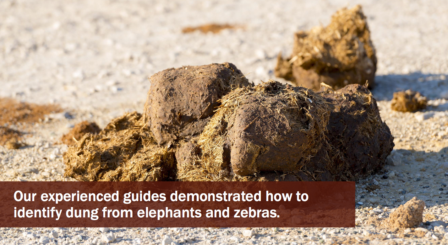
A story involving running from an elephant in Kenya to illustrate the danger of unchecked optimism.
A talk involving elephants, photos of dung, and suspense with a cliffhanger half way through, what more do you need? We were off for a great conference start!
Really good talk (Slides here)
Rule #1 Consider the human context
- Surround yourself with customer context and ask good questions of those around you and share this with the team
- We need our customers to guide us and keep getting back to them.
- When doing ethnographic research, don’t lead with your ideas.
- Try to think how the product make life better but also worse
- We need our customers to guide us. Not the other way around.
Rule #2 Design for the best case
- Explore all the possibilities and the consequences of success, what are the best problems you can have — cross channels
- Are you at risk of excluding customers? You can use Microsoft Inclusive design cards for this (you can download them here)
- Think about long term relationship and implication design for inclusivity from the start.
Rule #3 Plan for the worst case
- Don’t remove human agency, instead, provide tolls to overcome the worst.
- What matters is the proportional impact that the worst case has on a customer’s day or life, even if it’s just a single customer
- Learned helplessness and scientific detachment are dangerous but surprisingly common (machines don’t make error but you can trace the problem back to the engineering failure)
- Explore the tough questions before the cost is too high.
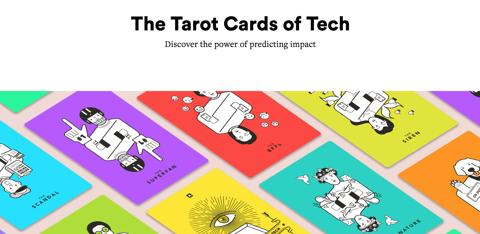
A tool to help us identify blind spots about how our customers might use/abuse our product: Tarot Cards of Tech
Rule #4 Be ready to adapt in the moment
- Allow to react to emergency
- Correct surprised bad scenario
- Bring emerging behaviours info to us
- Monitor
- Pair your nightmare scenarios with metrics so there is a signal if something is wrong
- Pair those metrics with thresholds and actions for remediation
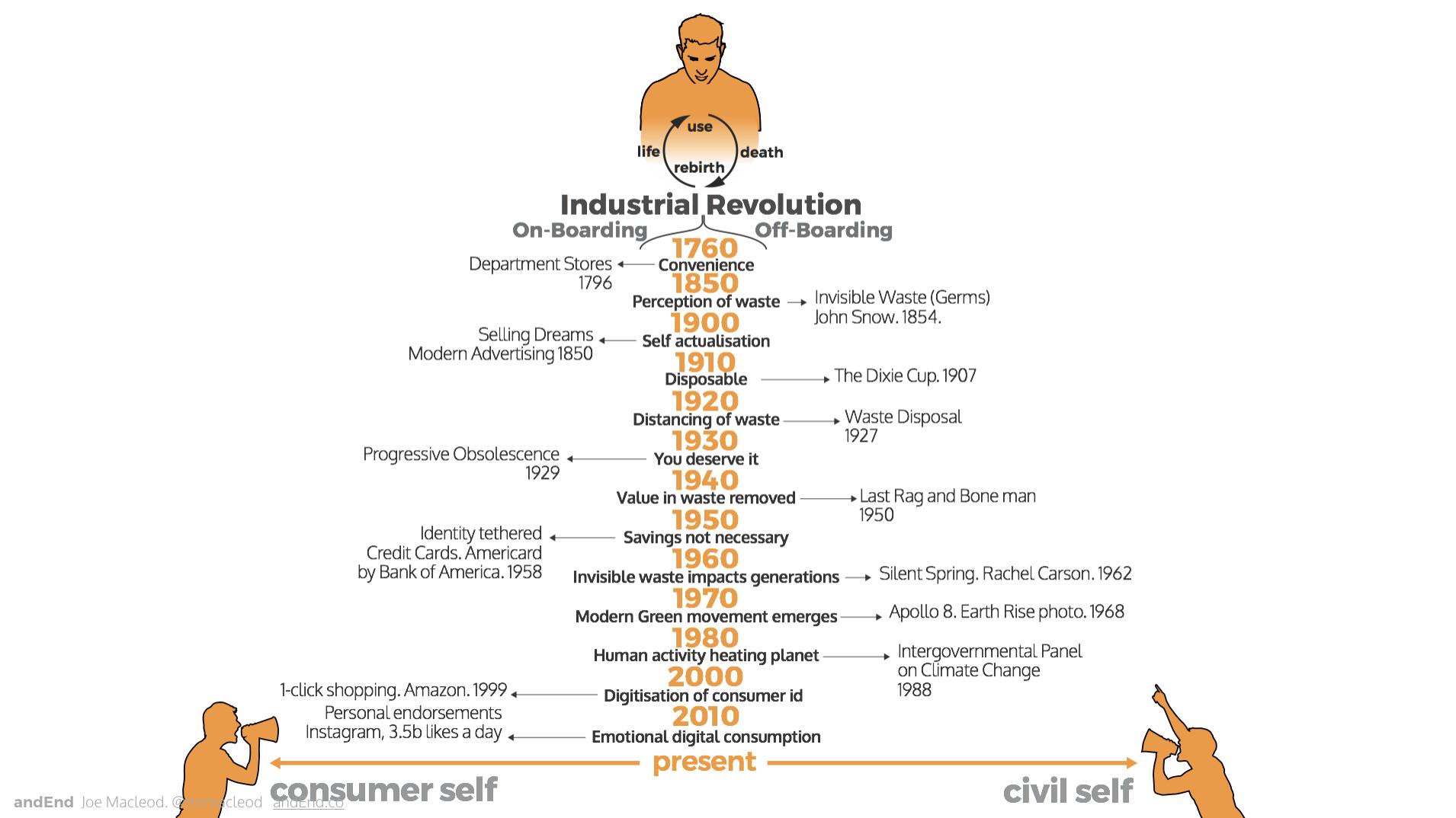
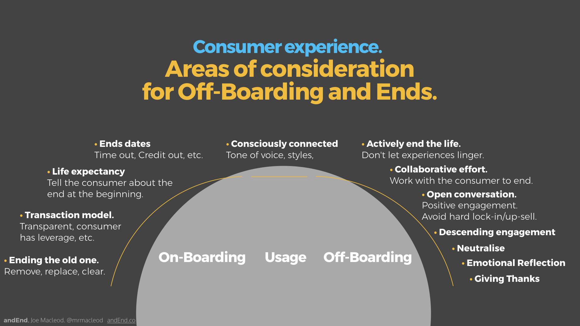
Joe Macleod — Ends. Why it is critical we balance the bias consumer lifecycle
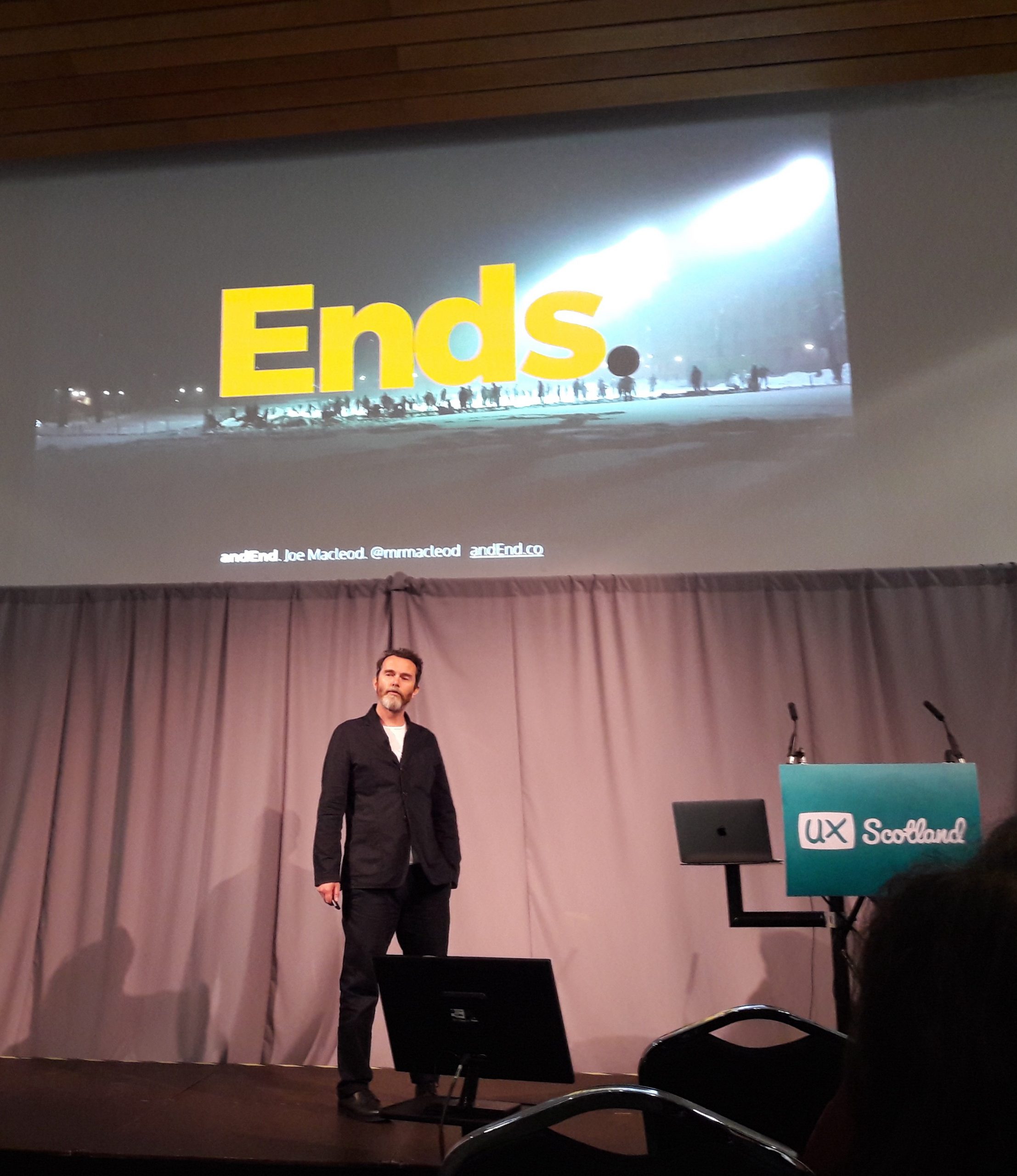
I had read the book (and recommend it) so was expecting the talk to be really interesting. I had not realised he was funny too. I really enjoyed it!
The slides and more are available here: http://www.andend.co/ux-scotland
Emma Howell — We need to talk about Frank: designing for the wild child of government

Talk to Frank is a website designed to provided honest information about drugs.
Emma took us through the work her team and herself did where inclusive design ways of working was essential. For example, they were very mindful to make the pages really light so that they didn’t eat up the mobile data of the people who had low mobile data packages.
The slides are here and really worth checking.
This is a content heavy website. Some words had a very negative connotation: ‘addict’ or ‘get clean’. A lot of work went in to changing this. They had to find the right tone of voice: an older sibling knowing what they were talking about but who would not judge you. Also the slang for name of drugs are very different from one area of the UK to the next, so interesting content problems as well as challenging gorilla research sessions.
The technical approach was critical too. They wanted good SEO ranking to make sure the kids would see their pages when they were searching Google for information.
The page should load quickly (they used AMP — Accelerated Mobile Pages), to make sure anyone could use it even with a bad network. After improving their technical architecture, they saw:
- 39% increase in site traffic
- 200% increase in user seeing pages load in less than 3 seconds
To make your project more inclusive:
- be able to define inclusive design
- start planning early
- start recruiting early (including accessibility issues) define segments, give the heads up to your recruiters
- use mixed methodologies (gorilla and more)
- use an accessible venue
- use remote testing (so they can use their own assistive technology)
- spend more time on set up (45min before minimum)
- establish relationships in your community
- work in cross functional teams
- keep an eye on each other (mental health, get a bit of down time after the interview)
- write an inclusivity statement
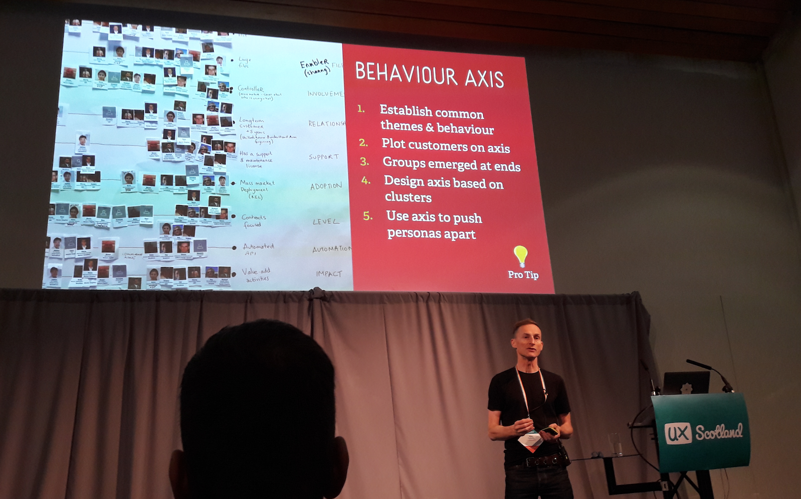
Sophie Dennis — The art of things not done
This talk is inspired by the second Government design principle: Do less!
The slides are here and well worth a look. Sophie took us through the Kano model and story mapping
“There is always more to build than you have the people, time and money for. Always.”
— Jeff Patton
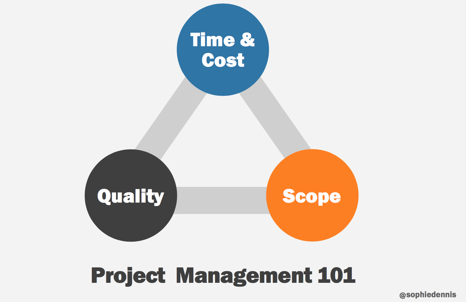
Time and cost is usually something you can’t change. Try to make sure there is a quality baseline and is non negotiable. As a result, you will need to reduce the scope: Do less!
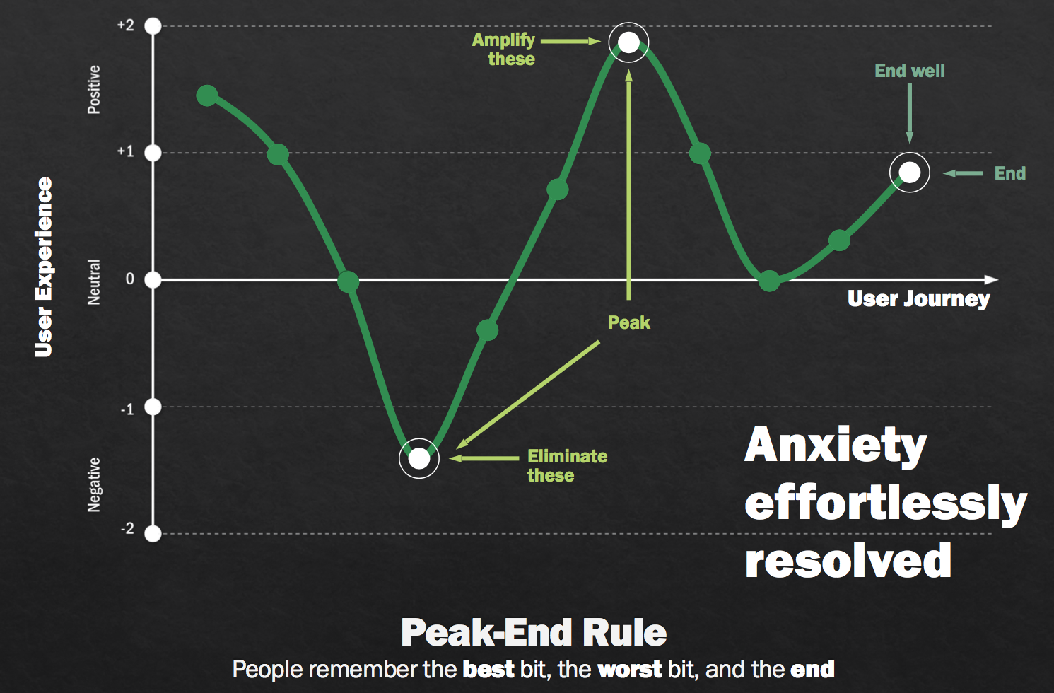
She explained the Kano model and used it to illustrate how you can make a conference a great event with a small ticket price
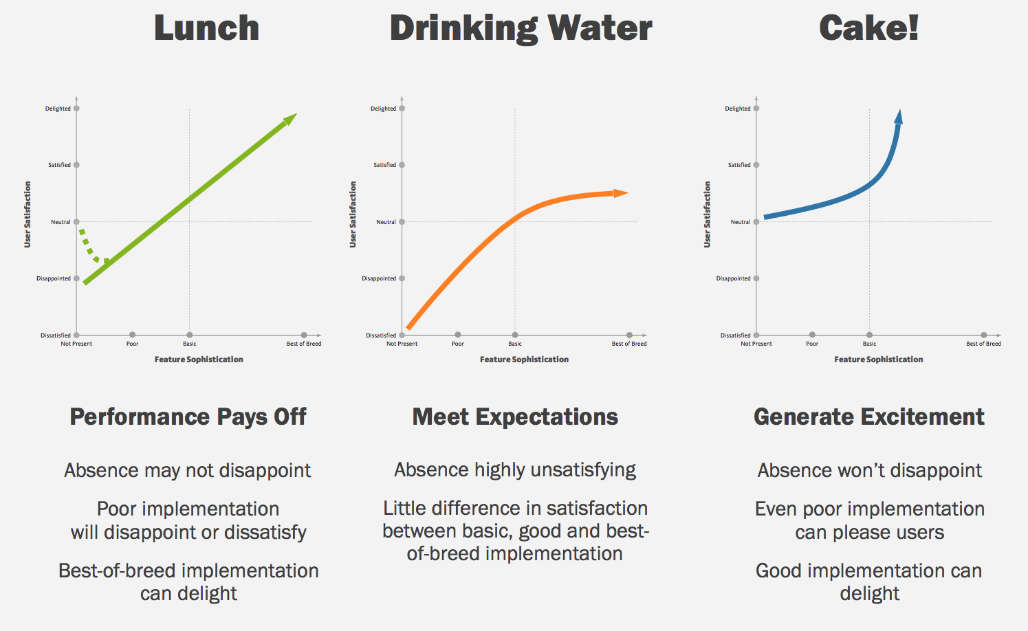
“Excitement generation”, in a few years, becomes ‘basic expectations”.
More on the Kano model:
Jared Spool: Understanding the Kano Model — A Tool for Sophisticated Designers
Jan Moorman: Leveraging the Kano Model for Optimal Results | UX Magazine
The Peak-End Rule
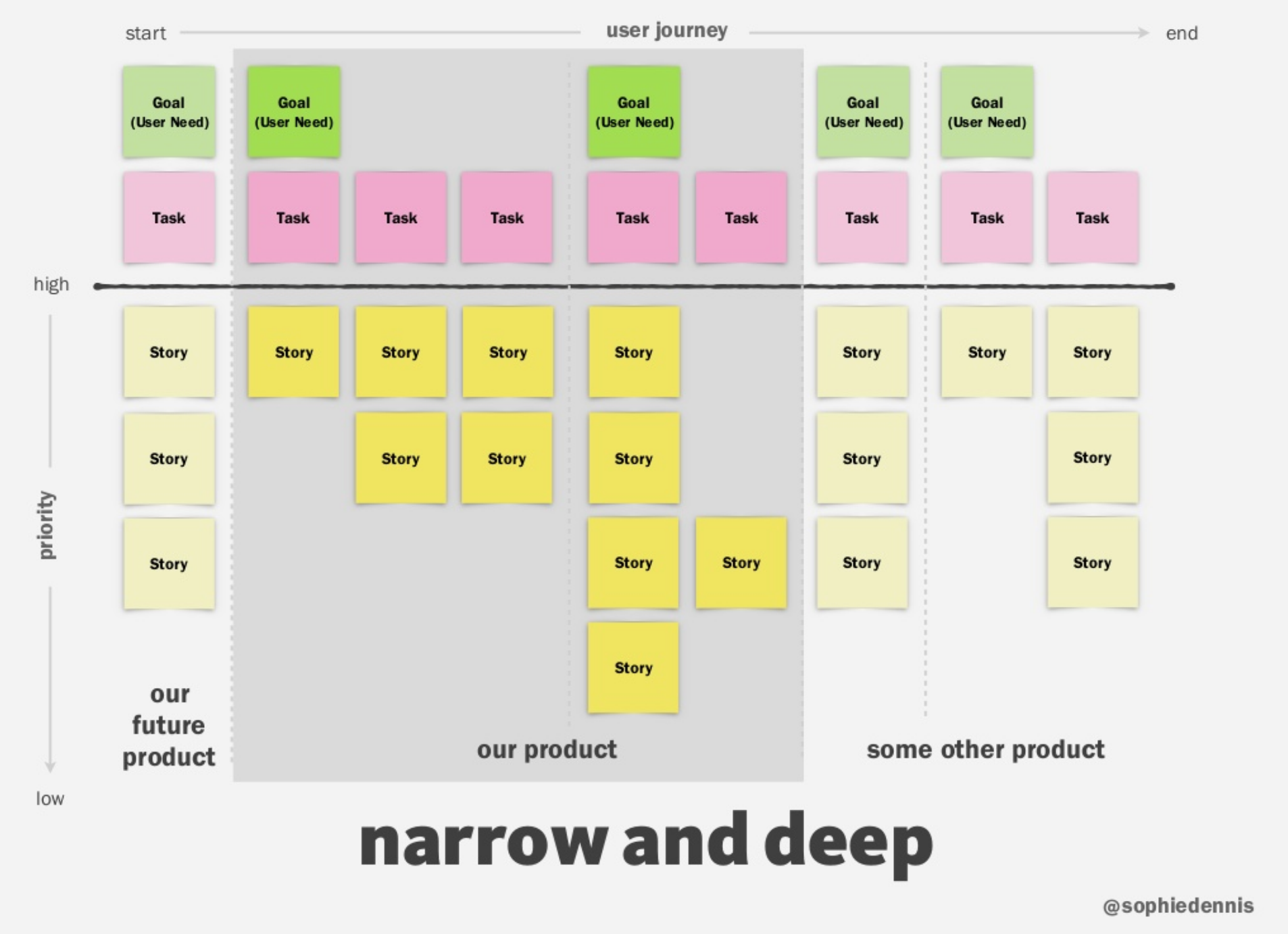
We also looked at story mapping
(Jeff Patton is a good source for that) . Once you’ve mapped your stories you can slice your backlog.
It can be ‘shallow and wide’. You take a small piece from end to end and do a first release with it then another release with a bit more etc…

Or it can be ‘Narrow and Deep’ to make a better experience on a small part of the user journey.
Michael Crabb & Rachel Menzies — UX with hard-to-reach people in easy-to-reach places
Both are lecturers at the University of Dundee. The aim of this research project is to develop an accessible office workstation for a disabled user.
The user Centre is set in the School of Computing in Dundee.
Really worth looking at their slides.
People who are hard to reach:
- older adults +65 (memory, eyesight and motricity issues mostly)
- AAC users (Augmentative and Alternative Communication)
- aphasia (mostly following a stroke)
The User Centre is an environment for them, a place to meet where we create value for the users, the researchers, the teachers and the university.
“ Older people like complaining and are not shy about doing it”
— Michael Crabb
To learn more:
SiDE: Social Inclusion through the Digital Economy
A pool of representative users for accessibility research: seeing through the eyes of the users
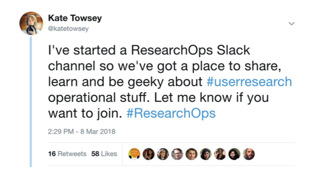
Jane Reid & Brigette Metzler — What is ResearchOps? A global Odyssey with a strong Scottish flavour
It started with a tweet:
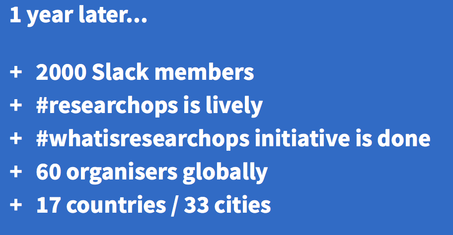
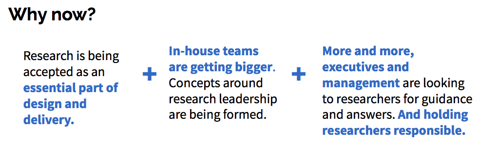
ResearchOps is the mechanisms and strategies that set user research in motion. It provides the roles, tools and processes needed to support researchers in delivering and scaling the impact of the craft across an organisation.
The map below shows the emerging practice of ResearchOps
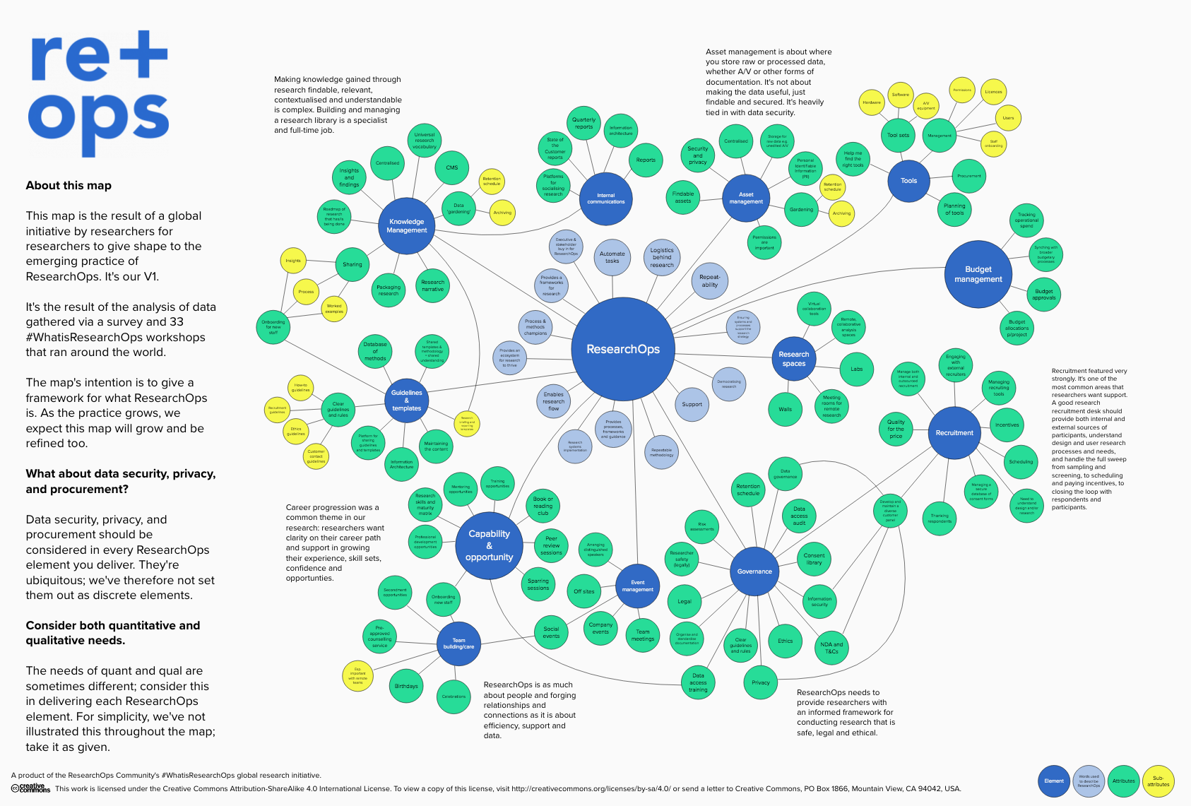
Below is the Blueprint of #WhatIsResearchOps?, the result of a global series of workshops and surveys held between May and August of 2018:

To learn more: ResearchOps Community
Amy Johnson — Rewire your team: Nurturing a neurodiverse workplace
She didn’t share her slides yet but on her website you can access a video of a similar talk:
She is a senior Mobile App Designer and describes herself as “atypical”
Culture fit is hard for people with ADD, AHD, Dyslexia, Asperger or Tourette’s syndrome:
- communication is different (both verbal and non-verbal)
- repetitive movements behaviours to cope with stress
- sensory sensitivities
- masking (to conceal their problems so not to attract attention)
People usually view autistic people as either geniuses or severely disabled and needing a carer. Which is not true.
“My perspective has allowed me to solve problems that are hard for others to crack”
— John Elder Robinson
There are 3 key areas that are problematic:
- hiring process
- work environment
- collaboration
She went on to provide advice in these 3 areas.
An important one: provide a wellness room / extra room to chill out if needed. Some people in the audience said they sometime booked meeting rooms just for them to be able to have a space to be alone, so it sounds like everyone could use such a place.
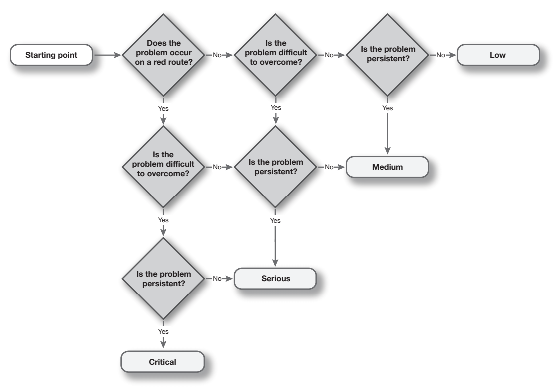
Neil Allison — Rapid reporting and showcasing of usability testing
One concept I didn’t know is the red route (David Travis): a part of your service that is so important that you can’t allow them to be blocked. This helps you prioritise your issues.
Take one usability defect everyone agrees is important:
- is this on a red route?
- is the problem difficult to overcome?
- did you see everyone struggle with it?
An objective prioritisation flowchart: 3 questions to grade usability issue:
Vanessa Barone & Woody MacDuffie — The biggest lie! The role of Design in defining new “rules” for data privacy
Sage Bionetworks is a non-profit biomedical research and technology development organisation. Their focus is to develop and apply open practices to data-driven research for the advancement of human health.
They proposed a Living and Breathing Privacy Toolkit:
Alan Colville — Unleashing the business-changing power of UX for B2B customers
With B2B you need to:
- get behind the functional and find the emotions
- have a shared understanding
- find the transformation stories to get to the shareholders
Lots of really good advice in his talk and really good persona templates, story cards, customer journeys, but I don’t have the slides yet and I don’t think you’ll be interested in lots of ‘dry notes from me’.
More on his website: http://www.colville.cx/
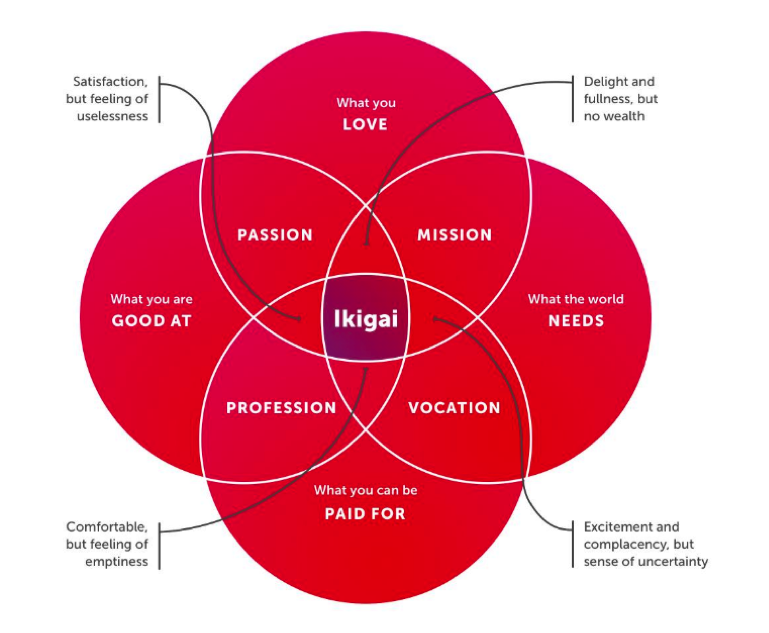
Tim Dixon — Beyond digital impact: measuring the value of UX
He covered:
- what is the Value?
- measuring the value in UX
- value in context
Individual value, a concept: Ikigai — a Japanese philosophy defining an individual’s purpose
Again, lots of dry notes but the slides were really good, so I hope they will be shared.
Resources:
- Measuring the Value of UX
- Balanced Value Impact Model
- Theory of change
- Occam’s Razor by Avinash Kaushik – Digital Marketing and Analytics Blog
Abi Reynolds & Steven Fullerton — Usability testing for voice interface: tales from Wizard of Oz testing
Smart speaker household adoption:
- 48% in the UK
- 55% in the US
“Design for how people talk rather than how you wish them to talk”
— Cathy Pearl
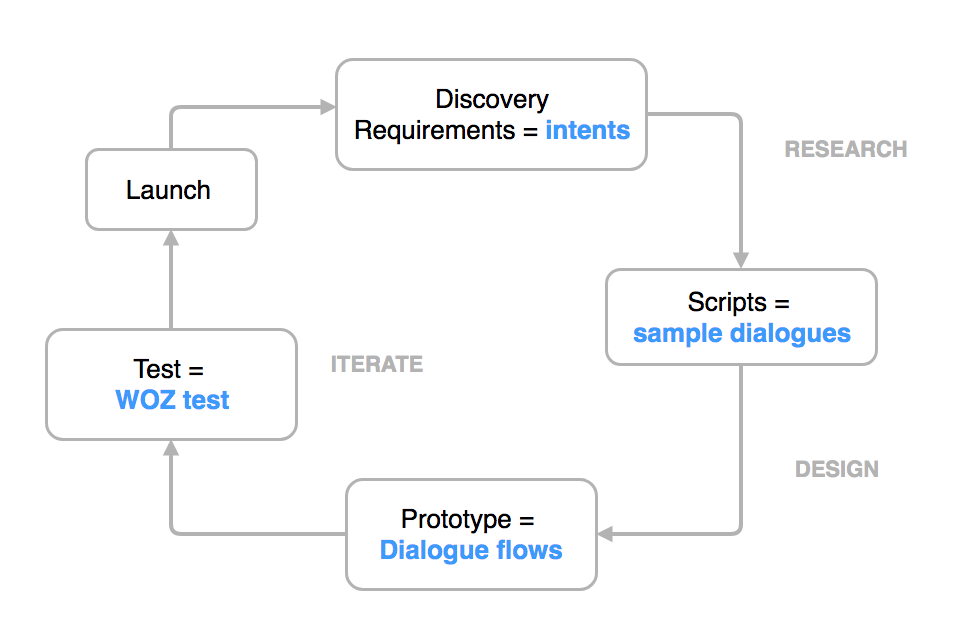
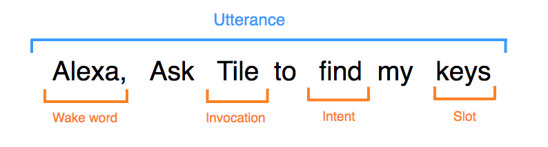
A dialogue flow gives you a direction the conversation can go (based on intents). It plots how you plan to respond to questions and guide the user toward their goal.
Intent = purpose
Tools used:
- Dialogflow to create the dialogue flow
- Amazon Polly (text to speech)to create the audio files you will need to mock your smart speaker voice
- Tortu | VUI design tool for any platform
- Sayspring – Prototyping Software for Voice Interfaces
- Botmock – Collaborative Conversation Design & Prototyping Tool
More talks I saw but don’t have the slides and didn’t take many notes
Will Myddleton — Research Heresies
1. ‘User needs’ is a harmful concept for training user researchers
2. Releasing things without user research is often desirable
3. User researchers don’t make recommendations
Sam Groves — I just want to be believed
I was part of her team at the CICA (Criminal Injury Compensation Authority). It was good to see they keep improving the service despite many challenges.
Talks I didn’t see but have links to share about them
Anne Dhir — Put on your own oxygen mask before helping others
(I had seen her at the Service Design in Government Conference in March and it was really good)
Memi Beltrame — Machine Learning for designers
Kirsty Joan Sinclair — The importance of mapping, and how to do it well
Jessica Cameron — Designing Decisions
Simon Duncan — Practicing Depth
Laura Yarrow — Experience listening
Ben Cubbon & Jessica Dilworth — Sharpening your research craft
Ed Chandler & Gayle Whittaker — WCAG 2.1 — raising the accessibility bar
Again it’s worth checking the website later as slides and more will be added to each speaker presentation.