Data terminology, resources, how to manage, interpret and visualise data.

Data is everywhere
So whether you like it or not, it’s probably best to understand the various aspects of it. This is what I’m trying to do here.
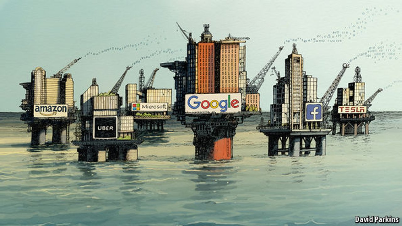
“The world’s most valuable resource is no longer oil, but data”
— The Economist
Data terminology
Some terms are probably familiar already.
Big Data: is a field that analyse, systematically extract information, or deal with data sets that are too large or complex to be dealt with by traditional data-processing application software. You need parallel computers to work with it.
Data lake: a massive, easily accessible, centralised repository of large volumes of structured and unstructured data from various sources. Its architecture is a store-everything approach to big data. A data lake is less structured compared to a conventional data warehouse. When the data are accessed, only then are they classified, organised or analysed.
Data swamp is a deteriorated and unmanaged data lake that is either inaccessible to its intended users or is providing little value.
Data mining: a process used by companies to turn raw data into useful information. It implies analysing data patterns in large batches of data using one or more software.
Edge analytics: analysis of data from some non-central point in a system, such as a network switch, peripheral node or connected device or sensor. You usually don’t keep the data, and just process it at the point of capture.
AI: collection of different technologies. When they come together, they enable a machine to sense, comprehend, act, and learn with what seems like human levels of intelligence. Note: I have a post on Resources about Artificial Intelligence if you want to learn more about this.
Machine learning: find patterns in data.
Data literacy: desire and ability to constructively engage in society through and about data — Bhargava et Al 2015
This is just one definition, I think the way you present it also helps people to engage with your data:
“Most of us need to listen to the music to understand how beautiful it is. But often that’s how we present statistics: we just show the notes, we don’t play the music.”
— Hans Rosling
More about data and visual literacy in this article:
Why visual literacy is essential to good data visualization – Benjamin Cooley in Medium
The 7 V’s of Big Data
(some claim 3 Vs, some 5, some 7 or 10 …. )
Volume : how much data we have — what used to be measured in Gigabytes is now measured in Zettabytes (ZB) or even Yottabytes (YB).
Velocity: the speed in which data is accessible. It’s often real-time now.
Veracity: making sure the data is accurate, which requires processes to keep the bad data from accumulating in your systems.
Variety: it can be unstructured (voice or images as opposed to text for example) and it can include many different types of data from XML to video to SMS.
Variability: constantly changing data can have a huge impact on it’s homogenisation.
Visualisation : for your data to be useful you need to provide an efficient and meaningful visualisation of it. (more below about this)
Value: data can improve decision making and operations. As a product, data has to be cleaned and treated so it can be used.
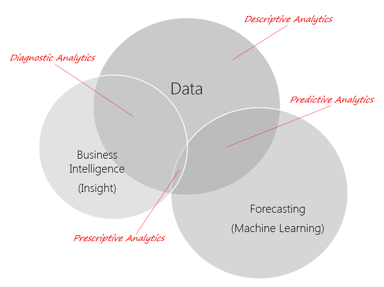
Different types of analytics: Descriptive, Diagnostic, Predictive and (the holy Grail) prescriptive
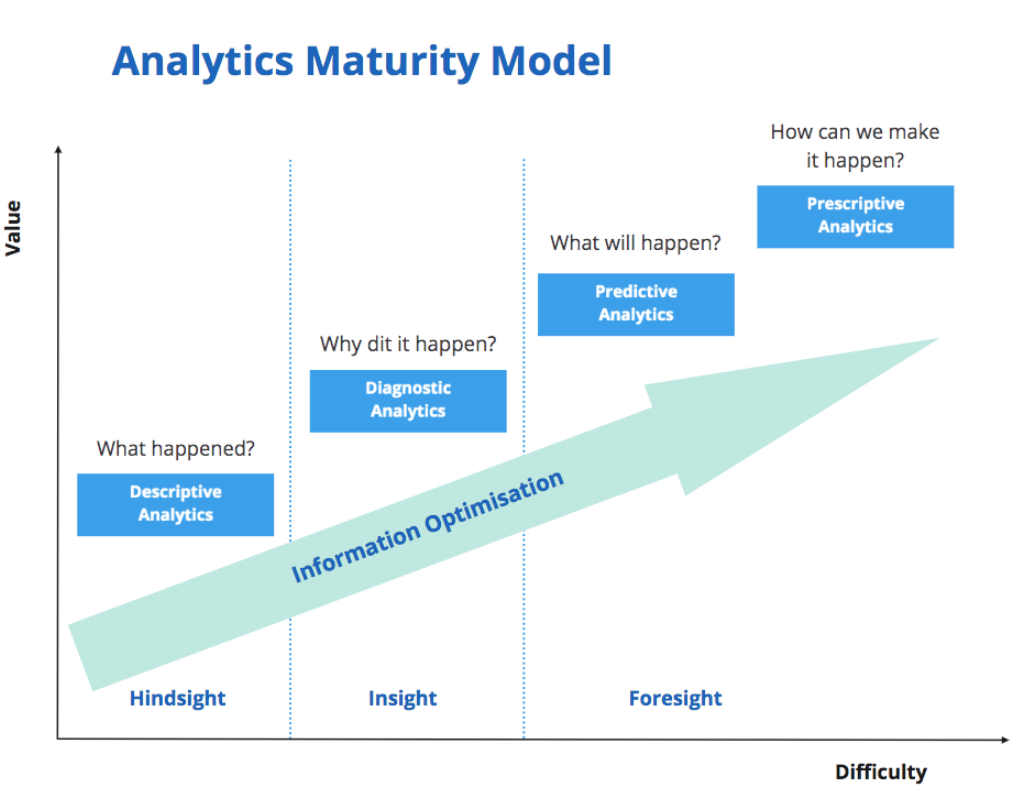
Maybe a better way to explain these with this diagram:
Interpreting the data
The human brains is wired for visual processing: When we see something, our brain tries to make a sense of whole instead of focusing on individual parts. So we need to make it easy to see patterns in data.
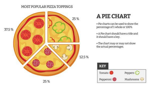
Also, our brains are pretty bad at angles: no pie charts (unless you are showing things like time as clocks, or pizza slices).
Pre-attentive processing
This takes place in our sensory memory; it requires no conscious effort from the viewer to do this processing. It’s automated and takes less than half a second to complete.
There are 4 pre-attentive attributes: form, colour, position, and motion.
We need to use them to show patterns and key information we want our audience to focus on.
Preattentive Visual Properties and How to Use Them in Information Visualization – Interaction Design Foundation
Gestalt Principles: Secrets of Hacking Human Brain by Design – Medium
Visualisation: communicating the data
People like stories. So structure the communication of your data like you’re telling a story.
Process to follow to communicate your findings
Think of:
- the problem / question to be answered?
- the wider context for the question being asked
- analysis done
- the key points of the output: what action do you want to happen (‘so what’) your title should reflects this output (give the answer in it)
- the format of the story: how is it presented, how long have you got?
- creating the journey that leads to the key points (only include information that supports the key points)
- creating the output: where is attention focussed?
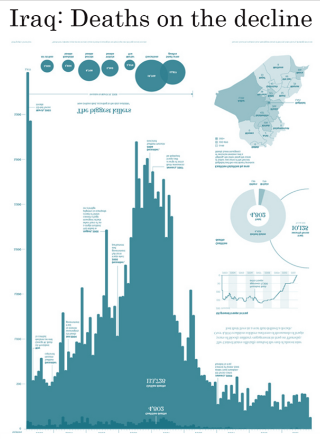
A classic example of data visualisation — bring the data back to numbers easier to process
An example of using your data to tell a different story
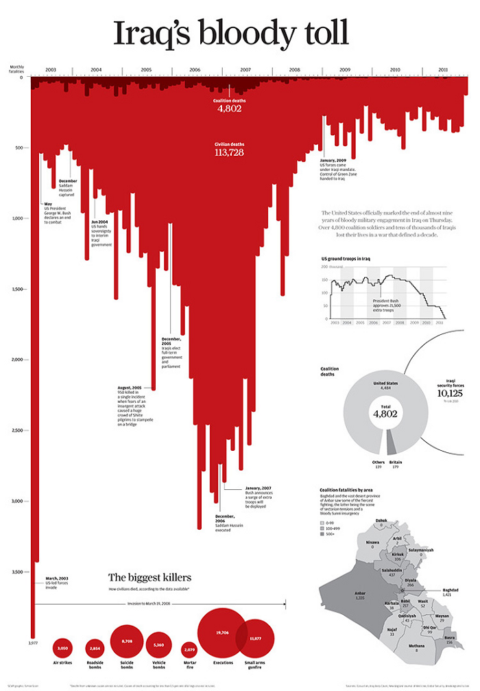
“Three simple choices create the strong emotive message: title, colour and orientation of the bars”
“The title tells you how to read the chart. Just three words — “Iraq’s Bloody Toll” — establish the author’s agenda. Second, the bars point downward. Finally, they are red. What do you see? A smear of blood, dripping down the screen or page.”
— Andy Cotgreave
How GOV.UK shows performance data of various data
Nice and simple. You can select ‘Service data’ in the top menu to see other service s— not just Voter registration.
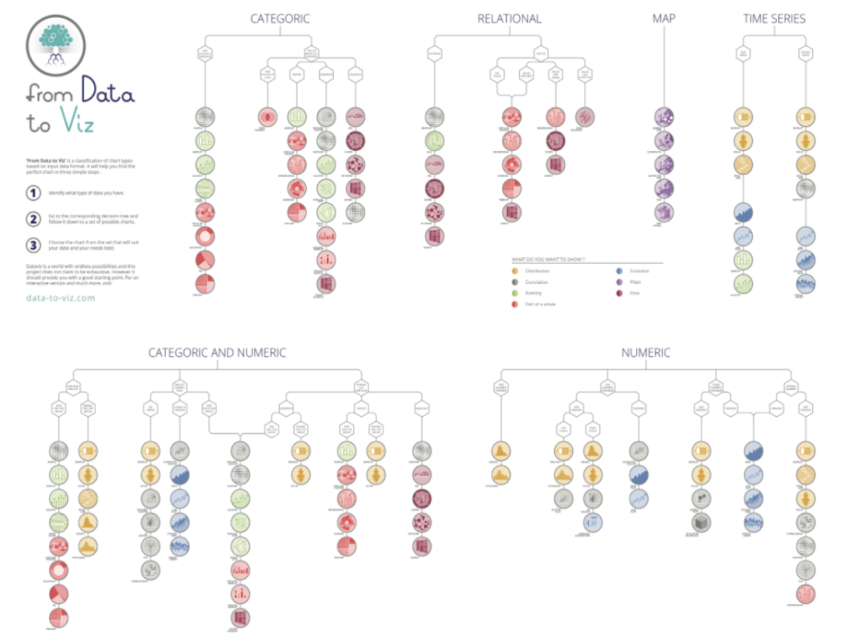
How to chose the most appropriate graph for your data?
Two really good links from this article:
From data to Viz | Find the graphic you need
More on telling a story to visualise data:
How to Use Storytelling Conventions to Create Better Visualizations – Medium
What’s the path of your data? – Medium
How to design effective data visualisations – Medium
Data management
I’ve left this part to the end as it is clearly not my favourite part …
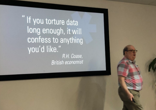
Data quality: garbage in / out (GIGO). You’ll never get perfect data. A lot can happen: it gets out of date, or missing, in the wrong format, duplicate, or even plain “wrong”.
Garbage in, garbage out — Your analysis is only as good as your data

You need to improve your data at the point of capture ideally, but it can go bad all along the way when processed.
Data quality needs:
- completeness
- consistency: can we match the data set across the data store?
- validity
- accuracy
- uniqueness: single view of the data
- timeliness (have a timestamp about when it was captured)
And needs to be monitored on a regular basis. At the minimum, monitor your key data items.
Data quality rules:
Business statement: this is the business context of a rule. It may also state the business process it is related to or why the rule is important to the business.
Rule specification: written in pseudo code, this explains at a database level the definition of quality data.
Coded rule: the actual programmatic rule, written in the system language of choice.
Data remediation: activity to remediate: every time someone call or every 2 years for example.
Data definition: There is often no common understanding of the data across the business. To write a good definition, it needs to be concise, precise, non circular, distinct and unencumbered.
Areas of data management: data governance
- modelling and design (what you need)
- storage and operations
- security
- integration & interoperability (how to access it)
- document and content management
- master data and references (key to access a set)
- warehousing and business intelligence
- metadata (the data about data)
- quality
- architecture
Data life cycle
If you google this, you will find lots of colourful diagrams with more or less steps, with arrows between two steps
Obtains / store / share / use / archive / need / check / destroy / create / analyse / monitor
Like this one from Defra’s Target Operating Model:
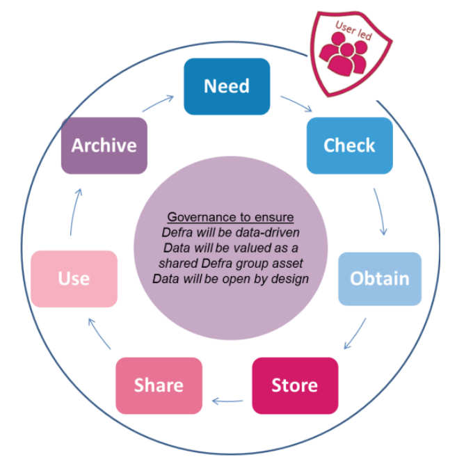
But you don’t just go from on step to the next like the arrows seem to imply. It’s more complex and messy in most cases.
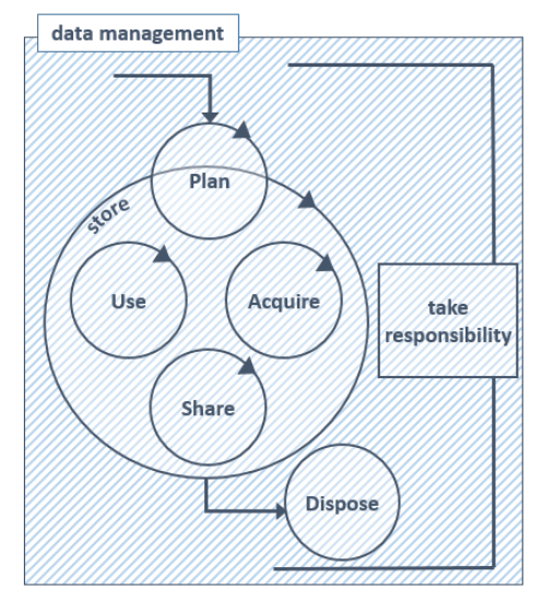
“Good data management is not the harness that forces data to jump through the hoops of the data lifecycle. It’s not a step in the lifecycle, or a box to be ticked. It’s the entire context for the conversation, the canvas on which we draw the data lifecycle. Even if what we draw isn’t always tidy.”
— Beck Strickland
Useful links on Data:

This post is based on a training day (paid by my employer Scottish Enterprise) I had with This is Milk by Jo Watts and various articles I read this year, most from Nightingale (The journal of Data Visualization Society)