I’ve just finished catching up with many talks from the SDinGOV Conference. So here are some thoughts on what made a speaker better than another for me.

Note: This is only my point of view. I attend a lot of events (all of them online since 2020), I don’t have hearing or sights issues. But I struggle a bit to focus now as I tend to multi-task more since I’m working from home and English is not my first language.
I have made a tl;dr (too long; didn’t read) recap at the end. Many of these advice can be useful if you are presenting something to your colleagues too.
Your introduction
Say where you are speaking from
I usually don’t care that much about the company you are working for. I know you probably have to do this but the shorter the better.
I’m more interested in what you do, who you are and what your experience is. For example:
“My positionality:
KA McKercher – from their slides for: Designing with
Transgender, queer person
White, non-citizen, on stolen Aboriginal land
Designer and design educator
Public servant, practitioner, keen observer”
Set expectations
- how long are you going to be speaking for?
- is the talk recorded?
- are you sharing your slides (if you don’t say it, then I usually end up taking a lot of screenshots and I don’t focus as much)
- how can I ask questions and how can I contact you?
- what are you going to talk about?
- is this going to be interactive? are you going to ask me to work in groups?
The slides
I struggle a bit now if there are no slides, I need a visual to support what you are saying.
Share them
If you do have slides, then please share them!
There were 34 sessions at the SDinGOV conference
- 25 were recorded
- 19 shared their slides
- 7 were not recorded and didn’t share any slides
I know they are sometimes confidentiality issues and you can’t really share your work as openly as you would like but if you prepared slides then people could potentially screenshot them anyway, so why not share them?
If you do share them, then a link to them is best so we don’t have to download really big files and even better: share them at the start of your presentation or before so people can follow on their device with the settings that works best for them and can follow at their own pace and go back if they missed something.
Are you the type of speaker who scripts what they will say and have a lot of speaker notes? Then please share your notes. This will be useful if you were not recorded to complement your slides, and for people who can’t hear you so they don’t have to wait for proper subtitles to be ready. As far as I know, Angela F. Orviz is the only person who did share her notes.
Make your slides accessible
- make sure your contrast are good enough
- avoid writing in all uppercase (it makes your text harder to read for everyone especially for dyslexic people as you lose the shape of the words and it slows your reading)
- avoid fancy font (also makes it harder to read)
- leave some space at the bottom of your slides so the captions don’t overlap
- describe any image assuming some in the audience can’t see them
- include trigger warnings if relevant
Some links to help you:
- How to make your presentations accessible to all – W3C resource
- Presentations – Readability Guidelines – by Content Design London
- Make your PowerPoint presentations accessible to people with disabilities – Microsoft support
- Create better conference slides and presentations – Stephanie Walter
- How to organise and run an awesome deaf accessible virtual event? – Hear me out
Numbers, nouns, acronyms and references
Put them on your slide so I can see them!
English is not my first language. When I hear a number in English, especially a big one, my brain still translates it in French first so I’m slow and never super sure I got it right.
Acronyms, even if you spell them for me, I might not get them until I see them, and say what they stand for the first time you use them.
If you are going to mention someone or a study, write their name and even better: give a link so I can get more info if I want to. It took me a long time to find the person one speaker was mentioning by name only with nothing on the slide.
Take your time
For me, the best talks were those where the speaker was speaking very clearly, with pauses to digest the info, with clear goals about what they wanted to say.
For some, it felt like they had too much to say, and I could not take it all in. So it might have been best to reduce the number of things they wanted to pass on.
Avoid jargon!

For this, I guess it depends on your audience, In some cases, your audience might be expecting the jargon. But even then, if you can use simpler words and avoid jargon, your talk will be so much easier to follow.
My top 10 talks in this conference had very little jargon in it and this includes the 4 keynotes speakers. You don’t need jargon to prove to others you’re a pro.
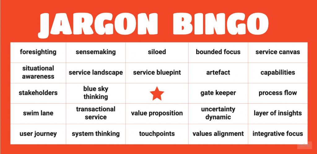
One talk was like Jargon bingo! In fact that one is on my to-do list: I’ll list all the jargon from it so we can start on a list of terms to avoid and how to explain them simply at work.
For service design, there is this list from Made Manifest, Ask a service designer.
Questions
Tell us when and where we can ask questions. It’s ok if we can’t ask any questions during the talk.
If you are answering a question from the chat or the Q&A panel, then repeat the question for everyone. “Great question Alex, here is my answer” is not enough as I might be unable to find it in the chat or cannot access the Q&A panel it is from.
Some useful links for public speaking
- Giving clear presentations – GOVUK blog post
- How to find something interesting to share at a conference — and how to pitch it to me – Sophie Dennis, Medium post
- How to do a presentation dry run – Alice Bartlett, Medium post
- How to look and sound confident during a presentation – Carmine Gallo, Harvard Business review
- 10 things I learned when I started public speaking as a Design Researcher – Tricia Lee
- Accessible speaking best practices – Deque
- How to speak so that people want to listen – TED talk by Julian Treasure
Short recap
In your introduction:
- say where you are speaking from
- set expectations (how long is the talk, sharing slides or not, how you deal with questions, what the talk is about)
Your slides:
- share them
- make them accessible
- make sure numbers, nouns, acronyms and references are on the slides
Take your time, avoid jargon and make sure you repeat questions you are answering to, if you are taking them from a chat or a Q&A panel.
Edit 07/02/22:
I’ve removed the recommendation about describing yourself, as since writing this post, I’ve read twice about blind people saying it didn’t matter to them and that they felt awkward about people describing themselves.
I also didn’t mention ‘land acknowledgement’ but if you want to make one, have a read through this article: Indigenous artists tell us what they think about land acknowledgements
Edit 28/09/22:
Describing yourself at the start of a presentation seems to be unhelpful and even disliked by a majority of people with visual disabilities. This PDF file of the survey by Karen McCall provides a lot of comments on this if you want to learn more.