This week, I presented a talk about inclusion at SDinGOV. One of the questions at the end was about the one thing I would like people to work on, and the first thing that came to mind was about being more inclusive in the workplace.
I don’t think we are doing very well on this. I’ve seen some improvements on hiring practice, but once people are in, we seem to expect them to be ok and fit in because ‘we are nice people’. It’s not that simple and in my experience, reality is far from the results of a online search for images to illustrate ‘Inclusion in the workplace’.
We could do better. In this post, I give some advice. It’s a starting point, but I think if we have this state of mind daily with our colleagues, we are more likely to extend it to people using our service – this is the service designer in me speaking 😉
Accessibility
It should be part of the mandatory trainings you do when you join a new place, with regular reminders. Many trainings are available (for example: AbilityNet).
It should be:
- embed in your system and processes
- tested with disabled people and improved until it works for all
- everyone needs to understand how to avoid making things inaccessible
Think: work documents, communications, running meetings, when you create training material
There is no disabled people here? Think again!
People often think of disability as something that is visible and permanent. There is a belief that internal systems do not really need to be accessible, that no one working with you is disabled. It might be true at a point it time (I doubt it!), but this could change.
- people sometimes do not declare their disability to their employer/colleagues
- many disabilities are not visible: hearing and sight impairment, dyslexia, chronic pain and many more
- current employees can become disabled after an illness or an accident, or have an injured arm for a while, or have an ear / eye infection
- you want to be able to hire disabled people who have the right skills for a role without changing your current systems when they start
Make sure your systems and processes are accessible for all
Neurodiversity
Neurodiversity is an umbrella term which cover conditions like Dyslexia, Autism (or ASD = Autism Syndrome Disorder), ADHD (= Attention Deficit and Hyperactivity Disorder), other ‘dys’ like dyspraxia, or dyscalculia, Tourette Syndrome, OCD (Obsessive Compulsive Disorder), PTSD (Post Traumatic Syndrome Disorder) and more.
There is a lot of overlap between these conditions. They affect how people:
- think, process information and language
- interact socially and communicate with others
- perceive space and time
You might not know that one of your colleagues is neurodivergent, because it’s often perceived negatively, so people are wary of disclosing.
Many people don’t have a diagnosis, it takes a lot of time to get one, and some people are not even aware that they are neurodivergent, especially women, as the description of these conditions are still full of stereotypes and more representative of young boys than girls and even less of adult women who often have learned to cope and mask.
Creating a safe space
It’s important to create a safe space. Don’t force people to disclose a disability or medical condition. Instead, offer help for everyone.
We talk about ‘accommodations’ for disabled people, but it’s better to offer various options to all instead, so it doesn’t sound like you are making a big effort just for them and that way, it will benefit more people who might not have requested anything even though they might need it.
Invite for feedback, and allow people to reach out privately: it’s not always easy to talk about your needs in public, or in a group during a meeting.
I’ve heard managers say “oh I’m always available if you need anything or if you need to talk”, but then when you reach out, their calendar is packed, and during the meeting you can see they need to be somewhere else, and it’s obvious they are not really focussing on you. If someone reach out to you, don’t do this. Try to be there for them, or they might never ask again.
It can take time: People’s past experience might have been really bad, so it can take time for them to trust you.
Presenting – organising a meeting
Some simple recommendations to make things better for your colleagues:
- before the meeting, set expectations, provide an agenda, so people know what they are coming to, and do it again at the start of the actual meeting
- invite people to tell you if this might not work for them, so you can find an alternative before the meeting
- share your slides at the start of a presentation – even better: share them ahead of your meeting (in your invite for example and make sure your deck is accessible) – this will allow people to access them on their own device if they need to zoom or use a screen reader or need to change colours or font to enable them to read your text, they can also go back if you went too fast on a point they needed more time on
- keep content short and simple
- use plain English, explain jargon and acronyms, don’t assume people know them, invite them to say if something is unclear
- use a mic when possible, speak facing your audience, camera on if online, consider if a sign language interpreter would be useful
- leave some space at the bottom of your slides for people who need captions so it doesn’t overlap with the text on your slides
- if you are using online tools like Mural or Miro, plan for an alternative if you expect your audience to use them
- if your meeting is over an hour, then plan for a break and stick to it
- describe any image or diagram assuming at least one person cannot see, and if an image is not important, then get rid of it
- don’t assume people can read the text on slides: say/read anything important for your audience (quote, or Slido code for example)
- repeat the question someone asked before answering: if online, people might not see it in the chat, and if you are in a big room in person, the audience might not have heard the question
Micro coaching – step by step instructions
Instead of long and extensive training sessions on new tools or processes, provide micro coaching opportunities: offer help for 15min when the person needs it while using the tool and facing a difficulty.
Instead of ‘doing for’ someone, show them and provide step by step instructions. If possible, offer written instructions with images and a video option too. Once you have the instructions, circulate them to everyone, as someone might need it too but didn’t want to ask.
Do not assume you know what’s best for someone
You might think you know what to do because you’re learned about a condition someone has. But people don’t have the same needs even if they have the same condition, and needs vary in different contexts.
It’s always best to ask what would help. Have that discussion with the person. Don’t assume you’re doing the right thing.
Even some ‘good practice’ should be challenged.
Maybe no need for visual description of yourself
One example of ‘good’ practice we might want to revisit: some people are now giving a short visual description of themselves before they give a talk. It’s often encouraged by organisers, thinking this is good practice to be more inclusive for people who cannot see the speaker. The idea behind this I guess, is assuming that people are missing out because they are curious about what you look like, what you wear etc… I’ve always been puzzled by this, because when I listen to a podcast, I don’t see the people speaking and personally, I’m not curious about what they look like. The results of a survey from Karen McCall who has a visual disability show that this practice is unhelpful and even disliked by a majority of people with visual disabilities.
When I speak at a conference and give info about me, I say I’m a white woman in her ’50s. This is probably enough. I don’t think people need to know about my hairstyle, the colour of my glasses, or what I’m wearing.
Manual of me
A ‘manual of me’ can be a great tool to communicate what you need to work well. I’ve been doing this in project teams for a while and found that it helps me to tell people what I need and also to understand them better. There are various templates you can use. Here are some of the sections you can have:
- condition I like to work in
- the time and hours I like to work
- the best way to communicate with me
- the way I like to receive feedback
- things I’m good at
- things I might need help with
- how I like to be helped
Be careful though: make sure people don’t feel they have to share more than they are willing to.
Numbers, colours and maps
I’m a service designer, I create a lot of maps and visuals at work, and use data and numbers to tell the story of the service I’m working on to my own team and stakeholders.
Maps
Many people love maps, and diagrams, but some people struggle to process them. I try to have alternative to these maps and create text descriptions of them (as a slide deck for example). This can seem like a waste of time at first, but actually, this is a really good practice as it forces you to check your work with a different lens. If you can’t explain a visual using words, maybe you don’t really understand it that well. This usually improves my mapping, and the text version is often preferred by stakeholders as a way to provide feedback.
More in this: Why you need to make your maps accessible – GOV.UK blog post
Colours
You should not rely on colour alone to convey information when you create maps, spreadsheet or slides. You can use icons and text and different shapes for example. Make sure contrast are strong enough.
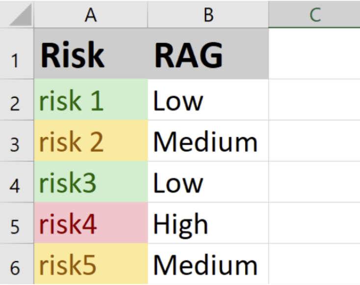
Be extra careful with the RAG system (Red Amber Green): you can use colours as it might be easier for people to instantly understand priorities, but add another way for people who cannot see colours.
Numbers
Until I came across the work of Jane McFadyen, Laura Parker and Rachel Malic, I didn’t realise the scale of the problem with numbers.
Low numeracy affects half the working-age adults in the UK
Some advice:
- don’t use too many numbers
- reduce the number of digits where possible: less decimal places, round the numbers
- prefer 1m to 1,000,000
- give the value instead of using percentages and fractions if you can, so people don’t have to do the maths
More on this in the Accessible numbers project to understand how to present numbers in a better way, and this blog post: Designing for people with dyscalculia and low numeracy.
There is a podcast episode where you can hear Laura speaking about this: Design systems and dyscalculia.
Some resources
Recruiting
- Interviewing Inclusively (Medium)
- How to run a careers event to increase the diversity of your team (GOV.UK blog post)
- POCC job board
- Underrepresented in tech
- Diversify tech
Creating accessible slides
- How to make your presentations accessible to all – W3C resource
- Presentations – Readability Guidelines – by Content Design London
- Make your PowerPoint presentations accessible to people with disabilities – Microsoft support
- Create better conference slides and presentations – Stephanie Walter
Icebreakers, online collaborating, inclusive meetings
- Inclusive icebreakers – by Lizzie Cass-Maran
- Moving on from Miro: Using Google docs as a low-tech alternative – by Lizzie Cass-Maran
- Inclusive meetings: encouraging collaboration from all – by Co-op Digital Blog
If you are curious about the talk I mentioned at the start, here are the slides:
And a recent recording of it: