I’m giving a talk soon and I’ve been trying to find a good way to provide an accessible alternative format for the slides. This post explains various things I’ve explored.
Context
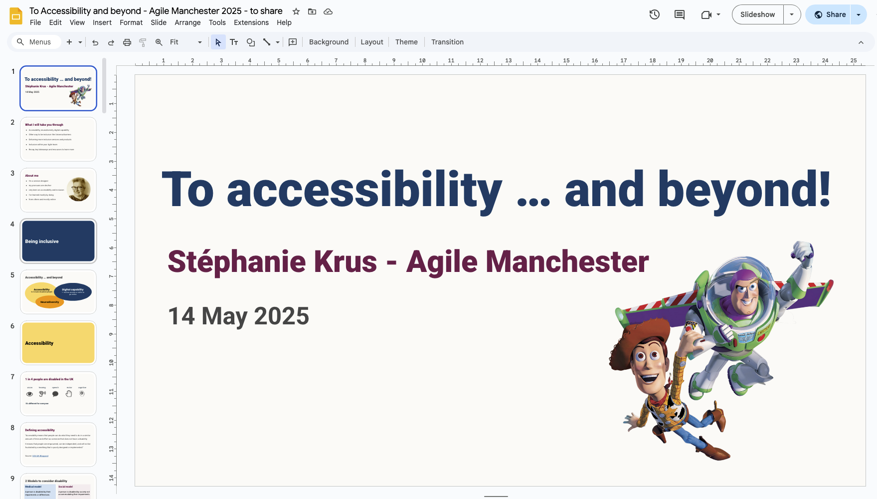
I’ve been asked to speak at Agile Manchester. It’s a talk about inclusion that I’ve given before at SDinGOV, but the audience is different so I ended up changing quite a few things to adapt to the audience. I wanted to provide more advice about how to be inclusive within your team and stakeholders, not just for the external users. One of the things you should do is to ensure that when you present slides during a session, you do it in an accessible way, share your slides ahead of the session and ensure your deck is accessible.
Different ways to share
I’ve written about this before in a blog post: Advice for speakers. When I attend a session and the presenter is using slides, I expect the slides to be shared. But they don’t always do that.
Sharing ahead
Very few will share ahead. This is great for me when they do. I can have a look before the session, understand better what it will be about.
During the session, I can relax, focus, go back in the deck if something went too fast for me. After the session, I can go back to the slides if I need anything.
“The slides will be shared”
In my experience, less than half the people who say they will share their slides actually do so. And even then, quite often you need to nudge them a few times. So I have trust issues now.
In a session, if I’m told “the slides will be shared” and I’m attending just for my benefit, I’ll take screenshots of the slides’ content I might need to go back to. In a work context, if I’m attending on behalf of my team, then I’m taking a screenshot of each slide because I don’t know what will be of interest to others. This means, I’m only half listening.
Sharing, but without the speaker’s notes
This is usually what you get: a slide deck file, often without the extra content the presenter talked through during the session, or a PDF version of the deck which doesn’t show the speaker notes either if there were there in the first place.
Sharing is important to me
For some public speakers or trainers, presenting to an audience is a source of income, so they might avoid sharing their slides as there might be a risk that people only use slides that have been shared instead of paying them for a training or to come and speak. I can understand this.
Public speaking is not something I ever wanted to do as a way to make money. For me it’s more about advocating. I want to try to convince people that they should improve their practice, that’s it’s doable. I want them to explore things. I want the message to be passed on. For me, sharing is important. So if my talk is recorded, I’ll share the recording. I share the slides, I leave speaker notes in there and create the slides with enough information so that if someone didn’t attend the session, they can still understand the points I was trying to make.
I share ahead
Whenever I can, I share ahead. This helps people decide if they want to come or not and if the session will be worth their time. This is true in conferences where you might need to chose between sessions, but also at work where you might not have time to attend a meeting.
If people use assistive technology, sharing ahead should allow them to use the tools they need to engage with the slides on their own device.
It’s about respecting people’s time, enabling them to take the right decision for them and to access the tools they might need.
Making your slides accessible
- make sure your contrast are good enough
- avoid writing in all uppercase (it makes the text harder to read for everyone especially for dyslexic people as you lose the shape of the words and it slows your reading)
- avoid fancy font (also harder to read)
- leave some space at the bottom of your slides so the captions don’t overlap
- plan to describe any image assuming some in the audience can’t see them
Some links to help you:
- How to make your presentations accessible to all – W3C resource
- Presentations – Readability Guidelines – by Content Design London
- Make your PowerPoint presentations accessible to people with disabilities – Microsoft support
Trying different tools to create my slides
PowerPoint
At work, PowerPoint is used most of the times. Checking that your slides are accessible is not that hard. The trickiest part is the reading order of the elements on each slide. This is important for people using screen readers. On a slide, you want them to start with the heading, and then go through each element in the right order. On a simple slide, it might be just the heading and then the block of text. But on a complex slide with multiple pieces of texts, shapes and pictures, it might be harder to get right.
Nicki Berry has a good blog post about this: Reading order in PowerPoint.
Google Slides
With Google slides, checking the reading order is harder. In their advice about making your Google slides accessible, they do not mention it. The order will normally be the chronology of how you composed the slide, so if you removed a piece of text, copy pasted a heading later etc… it might be jumbled-up. One way, to modify it, is by using the ‘Arrange’ menu and putting things forward or backwards. There is a plugin to check accessibility but it has pretty bad reviews. You are unlikely to have a deck working for screen readers. So you can save your slides as a PowerPoint file and fix the reading order there and share that file. Not ideal.
I’m also trying to avoid using Google products, and want to respect the fact that some people are also trying to use Google less. I mentioned it in my last blog post: Switching tech tools and services
HTML slides
This is something I’ve looked into, as not everyone has access to PowerPoint, and Google slides are unikely to be accessible to screen readers users, so HTML could be a good solution. This means your slides can be seen in a browser, and as you scroll down you access a slide after the next.
Craig Abbot is one of the people I know who share their slides in HTML. You can see how it looks like on the ‘Talk’ page of his website.
I’ve tried MARP, it’s free and using Markdown, which is a markup language used to add formatting elements to plain text documents. From the Markdown version of your slides, you get HTML slides. It is simple enough. It could work if my slides were mostly text, but I use shapes too and that won’t be possible with this. I’m not sure how to share or even create speaker notes which is another problem for me.
Another tool: IA presenter, looks promising. You need to pay for that one, but it looks good. I could use it, not only to create the HTML slides to share, but also to present. I think I’d be able to share the speaker notes, but I still have a problem with any slides with shapes.
It’s about the content – not the slides’ format
I could not find a good solution, but then I realised I was going at it the wrong way. Providing an accessible solution is usually not a single format that works for everyone and look the same for all. You provide different formats for different needs and preferences.
I want to provide access to the same content, and give a similar feel about how it’s presented. It doesn’t have to be slides actually. So I thought I could try to create a webpage with (mostly) the same content as the slides and the speaker notes, but not looking exactly like a succession of slides. That’s easier to do, if like me you know enough HTML and CSS.
The result – for now
I’ve done it for the talk I’m delivering next week. At the start of the webpage, I provide a link to a PowerPoint file alternative if prefered and to the Google slides. But I hope people will enjoy the page as a way to share this content.
You can access the page for the alternative format to the slides, and see for yourself.
How it works
The title of the talk is the H1 of my page. The section slides are my H2 headings and I’ve made them look like a ‘thin slide’.

Some speaker notes are displayed as such but others became content of the ‘slide’ instead.
Some diagrams made of shapes have been saved as SVG files from my Google slides and added with an alt text to describe them without too much details. My speaker notes contain the description I make during the talk, as when I present visuals, I make sure that if people can’t see the slide, they can still understand its content.
It’s time consuming but it helps with my prep
It’s extra work clearly, but this forces me to think about my intent, for example why I chose a diagram, could it be presented differently or should a text be on the slide or in the speaker notes for example.
Spending more time on my content contributes to my preparation to deliver it. So may it’s not such a waste of time?
Extra reflections
All this work coding the page was mostly enjoyable but confirmed to me that I really would not want to be a developer full time anymore. More work would be needed to do this properly.
I’ve fixed a few accessibility issues with my portfolio website while I was doing this, because this is where the alternative page for the slides of my talk will live. But I know there are more issues I should think about.
It’s a massive amount of content with the speaker notes. It’s a 45 minutes talk so of course it’s going to be a lot of content, but most people will probably feel it’s way too much to engage with it.
The result is not great on a mobile, and someone who needs to magnify their screen would not be able to use that page well, so it’s far from perfect.
I played again with ezgif to create an animated gif from some of my slides. The resulting image is not too big (100KB).
What next?
I might use the same format for my previous talk “Inclusion: going beyond accessibility and digital capability” and create a page for it.
I’ve submited a talk at SDinGOV in September and it was accepted. I might try IA presenter for it. We will see.
Edit 31/08/25: I ended up not using IA presenter as I still had some diagrams, like timelines, and images to use which might have made it hard to use it. So I’ve used the same format as for this talk: using google slides to present, sharing them, plus a PowerPoint file and a similar alternative format which you can access here for that new talk.