Conferences are a great way to get a huge boost. In a very short time, you get to meet people you only knew online before, meet new ones, share ideas, learn about what others have been working on, difficulties they came across, how they dealt with it, and gives you tons of ideas of things to try, and share back with your team.
3 days worth of talks would make a very long read, so I’ll just highlight what was the most important for me. Most slides of the presentations are on the programme page.
Everyone has their own definition of what Service Design is
“Service design can often seem like common sense but implementation is difficult”
– Marc O’Connor, HMRC (My first year as a service designer)
“Service design is the continual process of re-orienting an organisation toward meeting user needs”
— Ade Adewunmi (Keynote speaker on Day 3)
Matt Edgar (Keynote speaker on Day 1) added a twist to this:
Sometime what we are asked to design is only a very small step in a long user journey
And instead of just redesigning a form, you end up first spending time designing an eligibility checker like the team from NHS Business Service Authority looking at free prescriptions. Helen Spires and Lindsay Green explained the complexity of the scheme in a very interesting talk where we were introduced to the concept of Policy Lasagna: years of policy pilled over another and another, adding to the complexity each time. I’m sure this sounds familiar to anyone who has worked in a public service…
The team
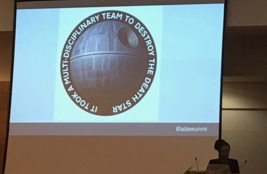
You need a multi-disciplinary team as highlighted by Ade Adewunmi below.
There was an interesting talk about Healthier hiring for digital government, by Matt Jukes and Jenny Vass which I didn’t see but they shared their slides.
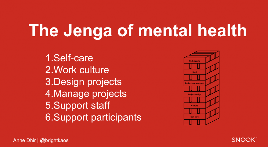
Anne Dhir (Snook) talked about mental health of your team: Put your own oxygen mask before helping others.
“As a team, we need to work with a balanced amount of engagement and detachment so that we can look after ourselves and each other.”
— Anne Dhir
Amanda Payne and John Fisher from Nomensa gave a talk about “one team mentality” and lessons from working with their clients in the public sector.
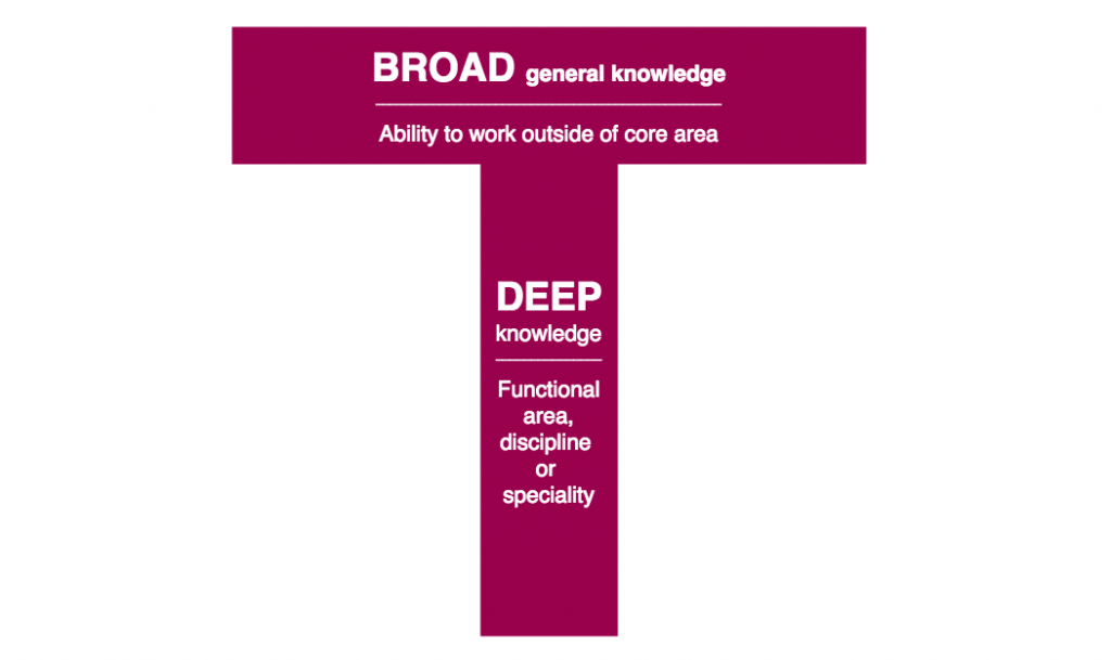
They highlighted how beneficial it was to have T-shape individuals in your team.
One thing a lot of stakeholders (from my experience) don’t always see is that sometimes:
“Successful delivery takes years”
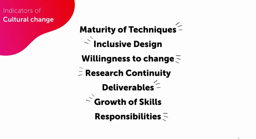
They identified 7 indicators to judge team behaviours leading to bad or good projects, looking if it’s just a box-ticking exercice or a real cultural change:
One of the recommendation was: “Get out of the lab and observe your user in the wild!”
This is exactly what Jenny Nelson from Newcastle City Council did with her team in the next part.
Chatbot in public services
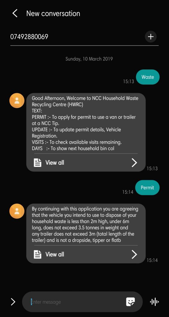
Another interesting talk and in particular the work done on Waste Permits for Newcastle City Council. The service used to be paper based, you would apply and receive the permit via mail. A lot of users were unaware and would end up on site with a van full of garbage and the workers would have to deal with very confrontational situations. The visit of Jenny Nelson and her team on site also highlighted that the reception was pretty bad but texts were ok. So they build a Chatbot with text messages. There are still some improvements to be made as the texts are a bit bulky and the syntax for entering your postcode for example is not very user friendly but this is already a huge success:
- Time to get a permit went from 14 days to 90 seconds! (… and allow you to do it on site if you were unaware of it)
- Almost 100% of channel shift with no complaints
- only 30 requests via contact centre in 2018
They added more functionalities, like checking your collection day for your household bins.
You can try here.
From the same talks, some bot principles by Jenny Thai (FutureGov)
- set the scope of the bot and keep it simple (most important — scope can change!)
- it should always introduce itself -with a personality – and be clear it’s not a person
- always suggest the next step
- respect and use the medium of chat
- provide an escape route
- track, measure and iterate
- always respond and be supportive
Regarding AI (Artificial Intelligence), here is an answer from Matt Edgar at the end of his Keynote:
“No AI until you fix the IA (Information Architecture)”
— Matt Edgar
Top Tasks
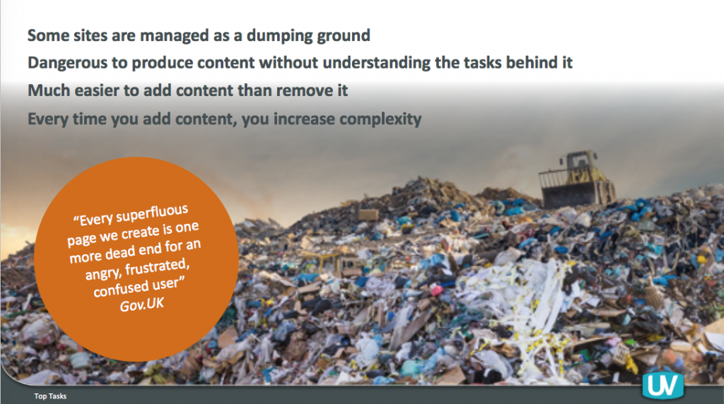
Talking about IA, Chris Rourke (UserVision) gave us some insights about the top task ID method using solid data from your users about what’s most important to them. Leading to better content management and a more effective information architecture. We had some concrete examples of the methods and some before/after websites.
He recommended reading: Top tasks A how-to guide from Gerry McGovern for more on the subject.
Accessibility
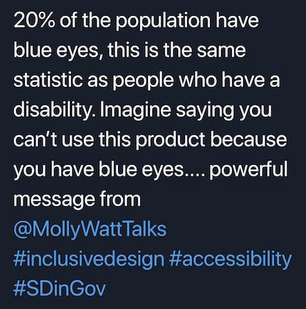
Accessibility came up in various talks. The workshop organised by Molly Watt (Molly Watt Trust) and Chris Bush (Sigma) with Bella (Molly’s guide dog) was about understanding a bit more the challenges and using assistive technologies. I got to try glasses to simulate tunnel vision and a glove for arthritis. It was a really practical experience of the tools and I especially liked her example of people with blue eyes to make the point about accessibility being a reasonable built-in adjustment for all.
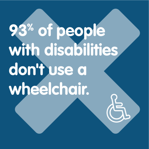
We saw that Zara should do much much better online if they don’t want to be used as an example of bad website in terms of accessibility. And airlines companies have a lot of to improve too. From Molly’s experience travelling, it seems obvious that companies still don’t understand that not all people with disabilities need wheelchairs!
A good occasion to mention Visability93
Let’s talk about sex and gender
Great talk from Jane Reid and Stephanie Holland on the work they did at Disclosure Scotland about asking for sex and/or gender in a way that didn’t meet the needs of trans and non-binary users.
“People may forget what you said, but they’ll never forget how you made them feel”
— Carl W. Buehner
Before asking these questions in a service, understanding legal, policy and cultural context is critical. The Census 2021 is exploring the question at the moment.
Like for any user research, you don’t want opinions, you need evidence to make decisions.
Flying the plane while changing the engine
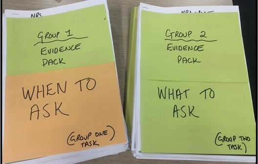
Hilary Brownlie and Chris McDermott from Registers of Scotland explained how they took a team of long-serving employees and give them the challenge of redesigning their work. They took them to see other teams, and look at what they liked. They came back with 2 days worth of ideas to sort!
Chris told us the story of Nummi: how a General Motors plant with terrible results and pretty ‘bad employees’ producing cars with a high number of defects, turned out to be a very successful plant when Toyota came in with pretty much the same employees and then producing very high quality cars. This was down to asking the employees: “ how can we make this better?”
- continuous improvement
- collaboration
- workflow
Take your breath before reading this quote:
“The more efficient you are at doing the wrong thing, the wronger you become. It is much better to do the right thing wronger then the wrong thing righter. If you do the right thing wrong and correct it, you get better”
— Russell Ackoff
Redesigning the Blue Badge service
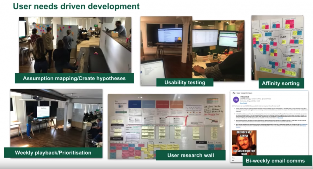
This is one of the most impressive work I’ve seen. Daniel Fyfield (Department for Transport) and Jim Strange (Valtech) explained how they worked with 207 Local Authorities to redesign the service. The service is very complex and involves working with other departments (like the DWP) in a tight time scale as they had to be ready when the previous service provider contract would end in February 2019.
They explained the challenges of testing with users with disabilities. We saw some videos of usability testing done quite often in the participant’s home. These type of videos were also shared at Show and Tell session done live on Youtube, every two weeks, where every Local Authority can join.
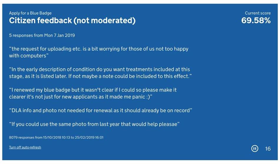
They continue to improve and try new things. To help build empathy with their users, they’ve started visualising their GOV.UK feedback. Using the Google Sheets API they pick 5 responses from 8000+ responses and display them, refreshing every 30 seconds, on their team TV.
Next step is giving a vote to each Local Authority to say what tasks they would like to see done next in the prioritised backlog. It will be interesting to see how this goes.
And one blog post coming soon about using the API to display feedback by Henry Neves-Charge.
ABCD: Asset-Based Community Development
This was another really good Keynote from Cormac Russell (Nurture Development). The idea is to ask people in a community what matters to them enough for them to help and contribute to make it happen. Looking at what people have first, instead of what they need.
You create a culture, build a community and create connectors.
Instead of looking at “what’s wrong” you look at “what’s strong”.
This was echoed by another talk I didn’t see: Place-based design: starting with what is strong, not what is wrong by Dr Joanna Choukeir.
More about this in this TEDx Talk from Cormac Russel
More links
Building a User Research library for local government — Snook
They shared their slides here.
Co-designing with vulnerable children and young people — Barnardos
They provided a link to their material, do have a look, it’s really good.
Finally
I hope this was useful. On their website you can find some of the slides on the programme page.
Next Service Design Conference: Wednesday 4 to Friday 6 March 2020.
In the meantime, I’m going to UX Scotland!

