You might know about Plain English or plain language, but what about plain numbers?
Only 1 in 2 adults have the numeracy level expected at primary level.
Maths makes 1 out of 4 people feeling anxious.
Last week was Service Week – an event for public servants where you can attend and / or present your work. One of the sessions was: Taking a plain numbers approach to service design by Rachel Malic, Clare Hussey, Ben Perkins from the Plain Numbers project and Ollie Sweetman. It was an excellent session. Here are my takeaways.
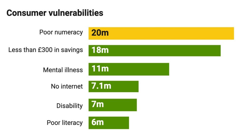
Poor numeracy is the most common vulnerability
This surprised me. This is based on research by the Financial Conduct Authority (FCA) made in 2015 for the UK, looking at consumers vulnerability. You can access the final report (as a PDF) , and the report on the research supporting it (as a PDF) too.
Both are a bit long but worth checking if you want to understand more about various vulnerabilities.
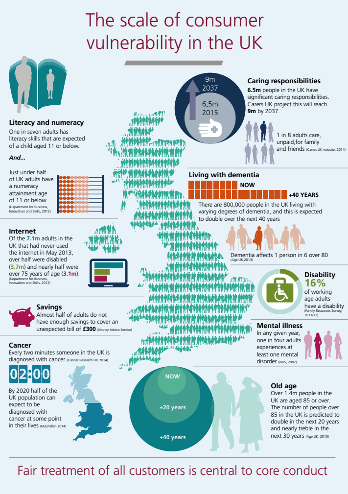
The infographic is a bit hard to read. During the session Ben Perkins used a diagram based on that same data which you can also see in their Plain Number Project report. I’ve made a simpler version below.
Some recommendations
Numbers do not come naturally to most people so they need to be presented in ways that most people can understand:
- don’t use too many numbers
- reduce the number of digits where possible: less decimal places, round the numbers
- prefer 1m to 1,000,000
- give the value instead of using percentages and fractions if you can, so people don’t have to do the maths
The context of the numbers is also important: the words around your numbers need to be clear, so avoid jargon.
One example
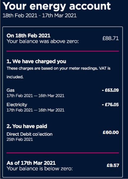
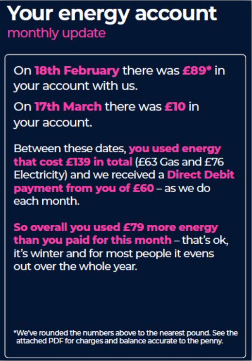
People understand numbers better as a story instead of a table. During the session, there was an example from the Plain Number Project report for Octopus Energy.
Previous version
Numbers presented as a table, with date range and exact amounts
Plain numbers version
This is text-based, telling a story, amount are rounded.
During the trials, there was a big increase in the understanding of the plain version for everyone.
More resources on numbers
The GOVUK Style guide page has a section about numbers.
It’s worth noting that dyscalculia comes under the umbrella term ‘neurodiversity‘. You can learn more on the British Dyslexia Association website.
If you work for the civil service, there is a group called: Civil Service Dyslexia and Dyspraxia Network you might want to join.
Edit 30/05/2023: check the Accessible numbers project by the same people who created the poster at the end of this post.
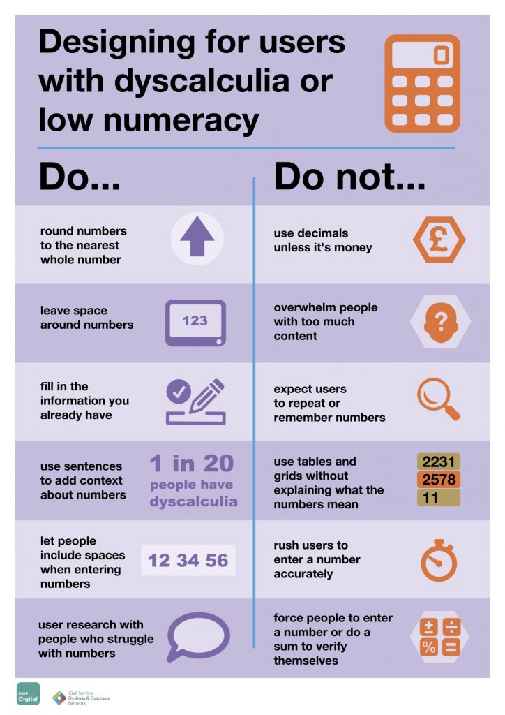
Do – Don’t Poster
This was added on 25 November 2022, after the publication of this blog post.
If you are familiar with the accessibility posters from the Home Office, there is now a poster for Dyscalculia or low numeracy. It’s available in different formats in the DWP Accessibility Manual which is a great resource for accessibility. You can learn more about the people involved in its creation too.
Check this really good blog post by Jane McFadyen, Rachel Malic and Laura Parker the authors of the poster: Designing for people with dyscalculia and low numeracy.
Edit 24/08/2023:
Laura Parker, Jane McFadyen and Rachel Malic, have also created this website Accessible numbers, which you should really check for the most up-to-date advice on designing with numbers.