In this post, I share the highlights from the sessions I attended. In part 1, I shared separately my experience as a speaker and reflections about online versus in person conferences.
This year, I choose to go to some workshops which are longer sessions, so I attended less sessions in total. I even took a bit of a break during the 2nd day and I’m glad I did, as I wasn’t as tired as usual while attending a 3 day conference.
I’ll be honest, I don’t think I’ve learned a lot of new things but this doesn’t mean it wasn’t useful. Many speakers were really good and I’ve enjoyed how they delivered their sessions. There were lots of concepts I knew about, but they were presented in a simpler and nicer way, and it’s always good to be reminded of things you have not looked at for a while.
You can check the conference programme’s page, they are adding icons for slides or blog post links when the speaker(s) provided them and the organisers will keep adding more as they receive them.
Embracing the complexity mindset
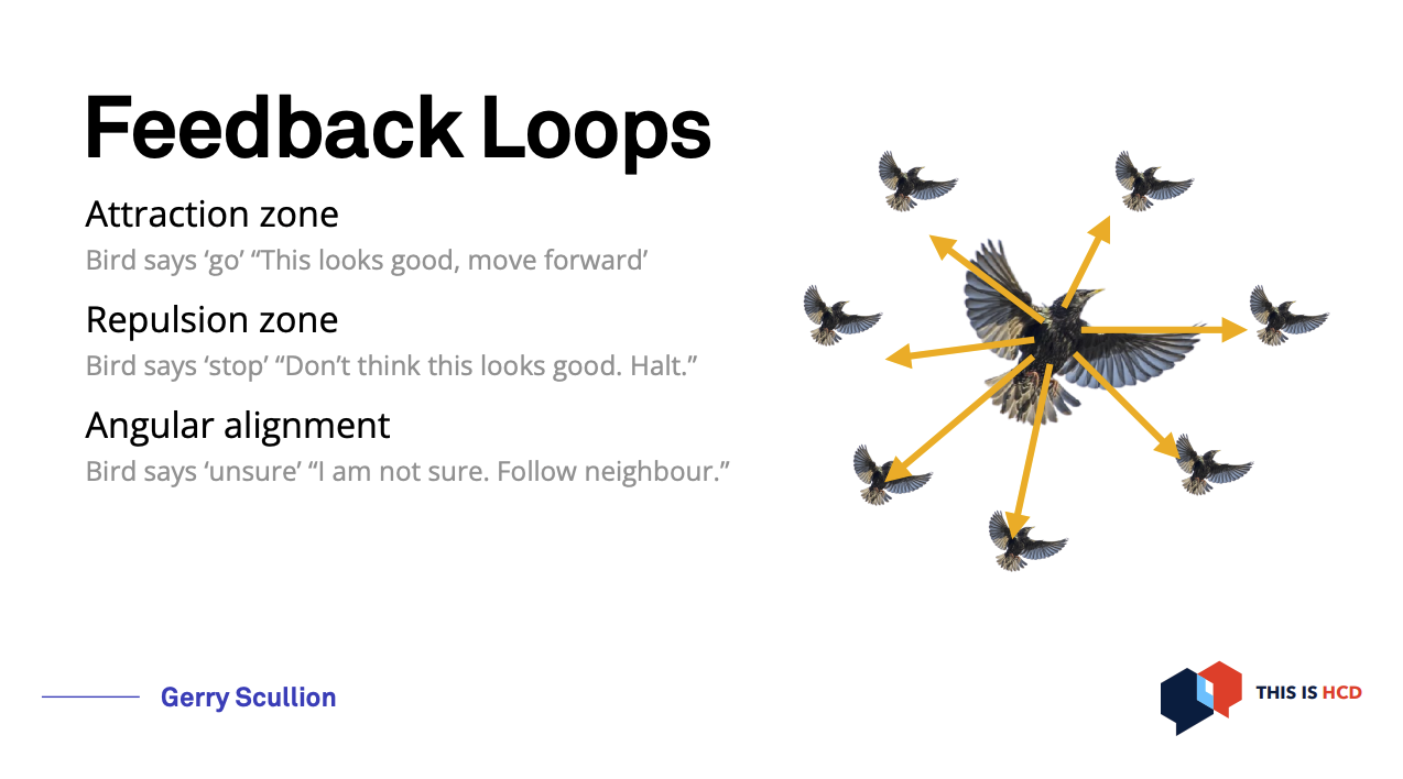
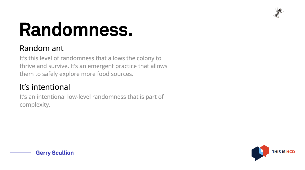
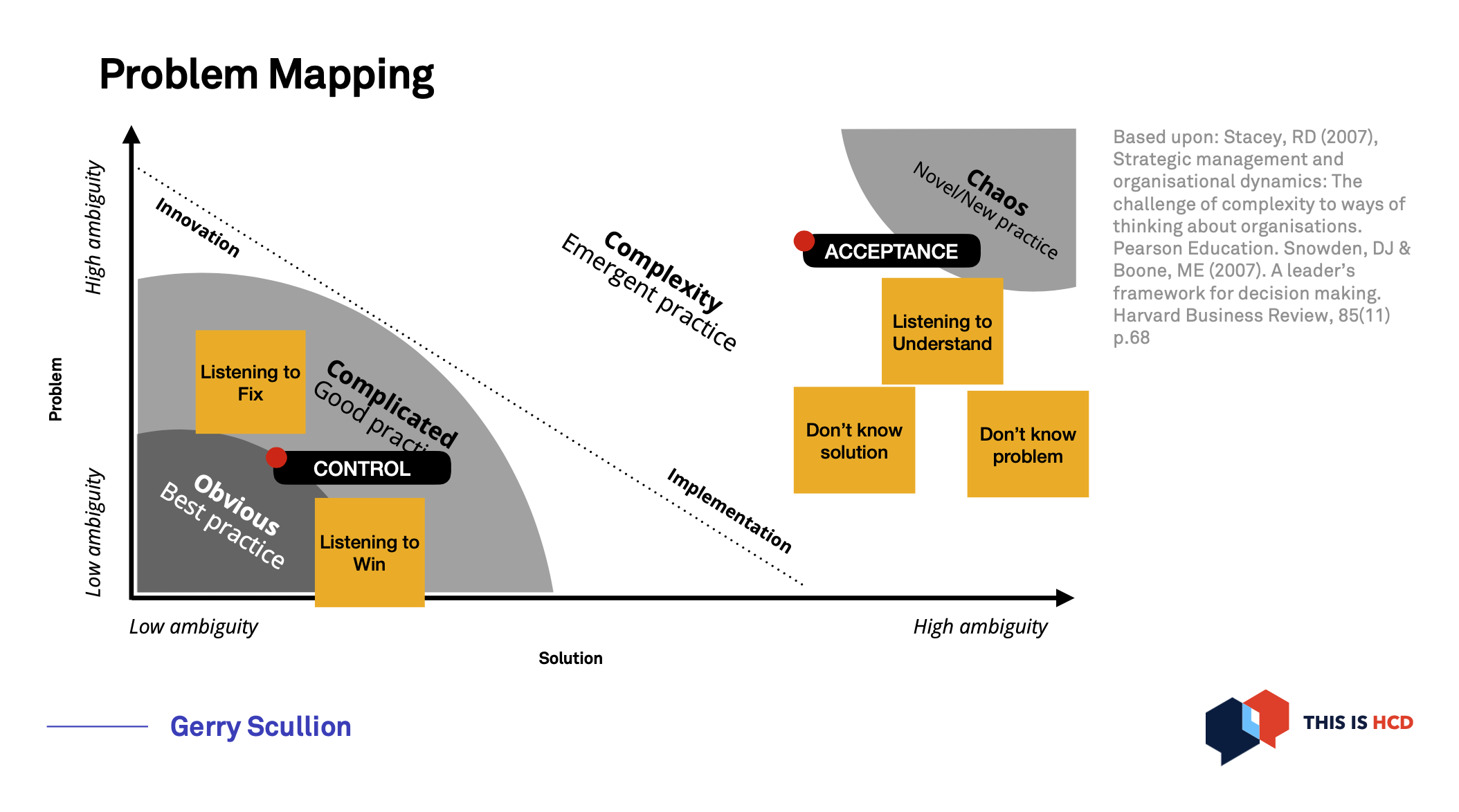
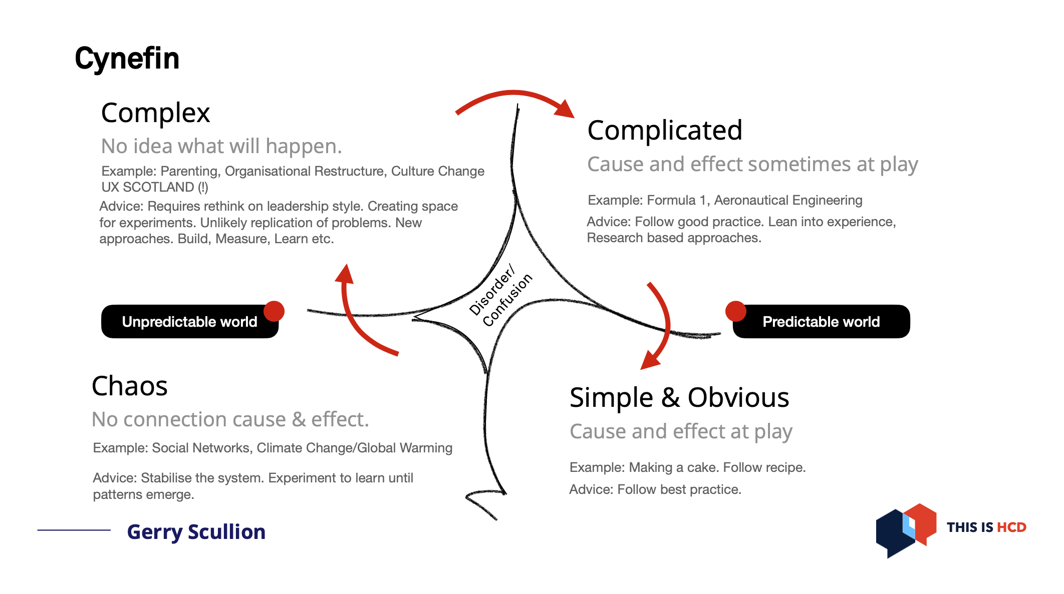
This was my favourite keynote speaker: Gerry Scullion. I enjoyed the topic, the slides, the delivery of the talk and the slides were shared. You will miss the animations like the ant moving around or the bird suddenly appearing on the slide but it will give you a good idea of what the talk was about.
Design ethically: From imperative to action
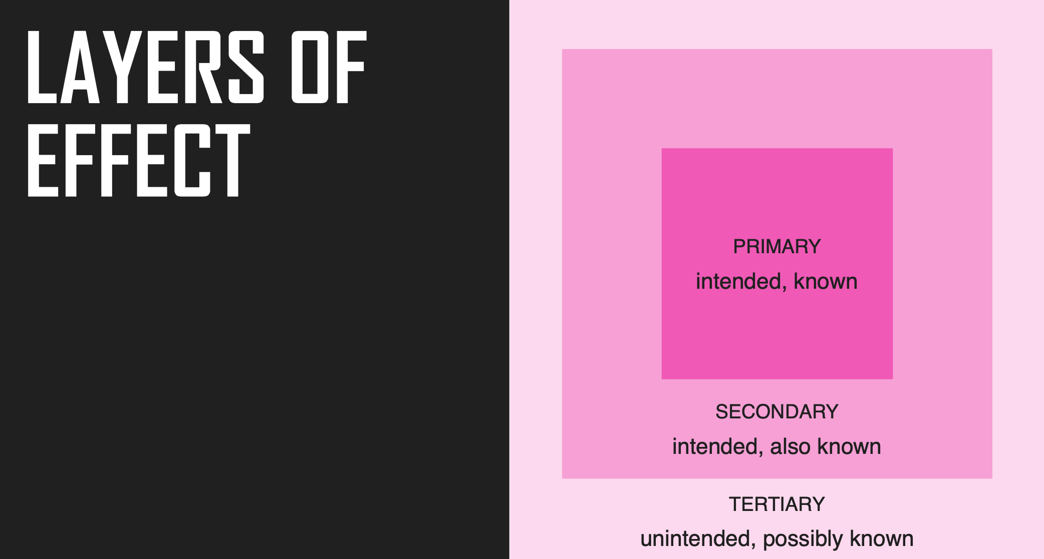
From Kat Zhou, keynote speaker, it was nicely done too but I don’t have the slides (edit 16/06: slides have now been shared). She shared her website Design Ethically where you can find a toolkit. On this website, there is a similar presentation you can check: Ethical design is not a spectator sport. The images below come from that presentation.
She adds 3 steps to the usual: Empathize, Define, Ideate, Prototype, and test.
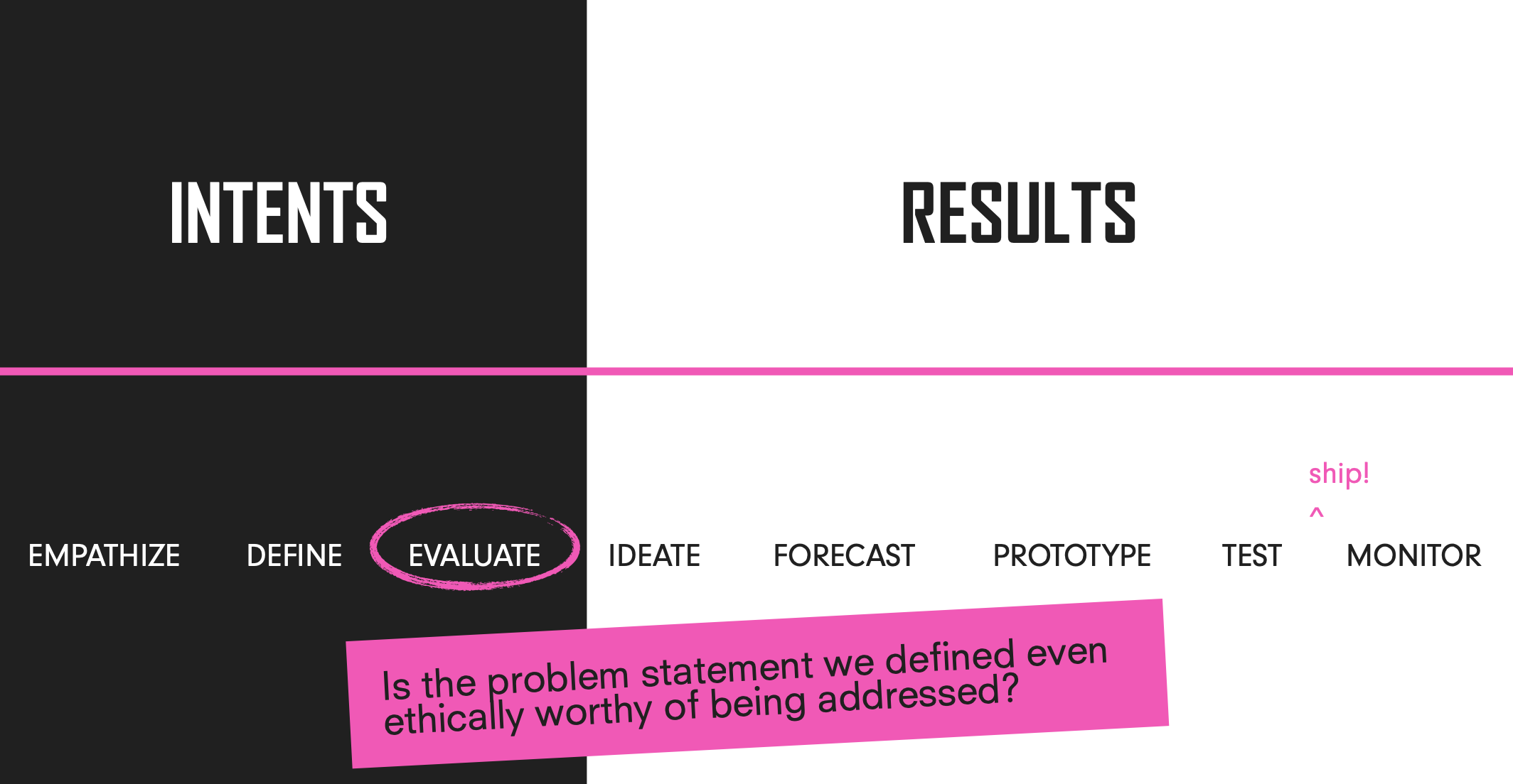
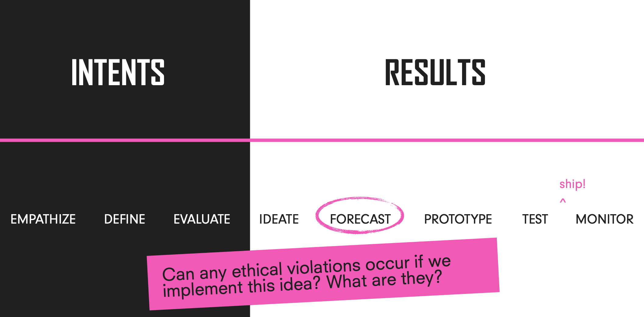
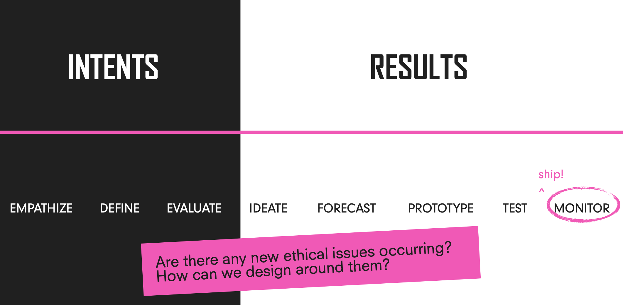
She also introduces the layers of effect. Designers should:
- define and design ethical primary and secondary effects. ‘Ethical’ meaning: anti-racist, abolitionist, sustainable, compassionate, reparative and equitable
- forecast tertiary effects and ensure they pose no significant harm (this includes no harm to vulnerable people)
Designing a high-performing and inclusive team
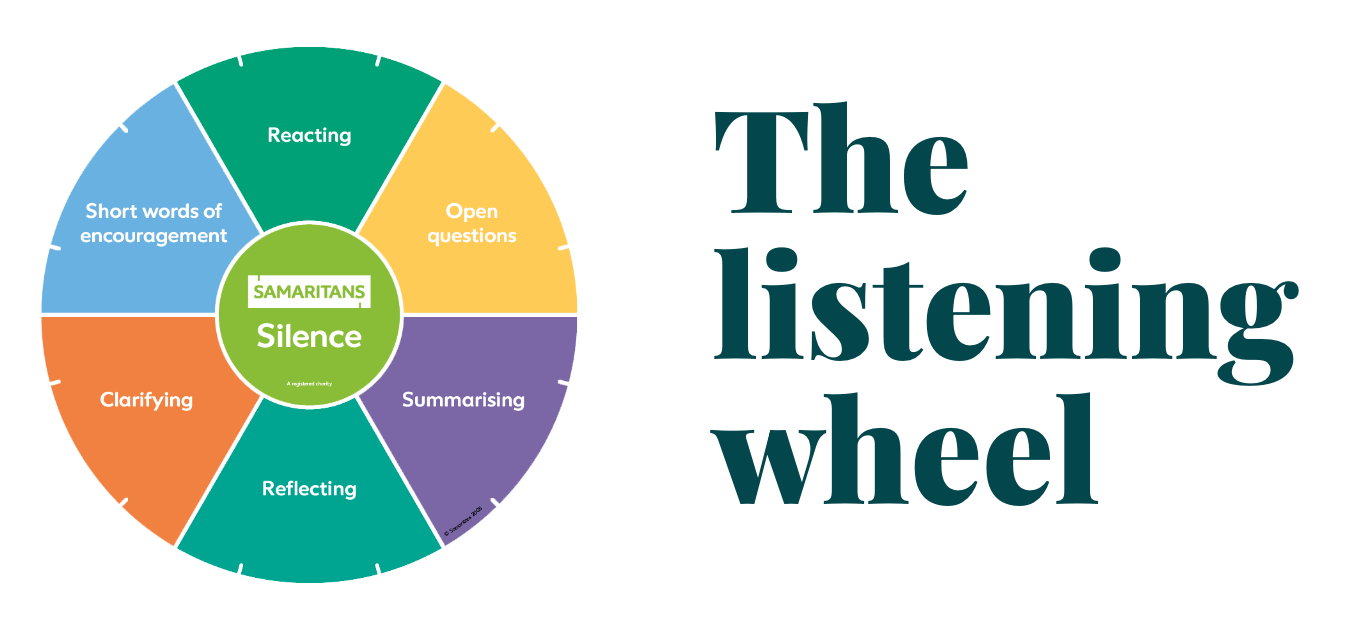
From Heldiney Pereira, another keynote speaker, product designer at Monzo and director of Samaritans. His talk was really good, he was sharing very personal things openly, but was also funny at times. He shared his slides. He shared the listening wheel from the Samaritans and how some of these principles were also guiding his work with his team at Monzo.
Building communities of practice
It was one of my favourite sessions, and no, I’m not saying this because it was organised by Kat and Neil, 2 organisers of UX Glasgow with Bobby and me. They organised a lean coffee session around communities of practice. It was a small group which is perfect for the lean coffee format and people were very engaged and we had good discussions on questions which got the most votes for 5 min or more depending on the thumbs up or down in the room. They have put the resources from the session on this page which includes how to do a lean coffee session. I got to meet and chat with Kellie Green whom I only knew online until now.
Telling stories
I attended a workshop run by Jonathan Waldheim-Ross: Don’t do a demo: storytelling your way to success, and the session of Rashmi Kakde: Persuasive visual storytelling in user research. Both completed each other nicely.
Don’t do a demo: Storytelling your way to success
Jonathan wrote a blog post about his session. He had a fun way to tell us his journey, using pechakusha with 20 slides of images which you need to go through in 20 seconds each. He had asked for a time keeper whose task was to shout ‘Next!’ every 20 seconds.
He explained 5 techniques to make your demo more engaging:
- start with impact not output (inputs means the work done by the delivery team)
- the hero’s journey (you can be the hero, your user can be the hero too)
- the pain point comparison
- borrow from the movies
- show your working
I think another technique could be added: Good sense of humour!
Our group discussion highlighted that:
- it’s important to get the context right at the start, don’t assume previous knowledge
- avoid jargon and make sure people understand or can ask in a safe way if they don’t
- set the rules of engagement so the feedback is done nicely
- have a wash up at the end to understand what you can improve next time
Persuasive visual storytelling in user research
I’m not a big fan of storyboards, but the rest of the session was really useful, the slides were shared. They should appear on the UX Scotland website soon.
Difficult conversations
Again, the talk from Ceri Newton-Sargunar: Profound transparency: fixing feedback and a workshop run by Jack Fletcher, Suhail Hussain and Tom Burrows: Debate club: how to deal with conflict, completed each other nicely.
Profound transparency: fixing feedback
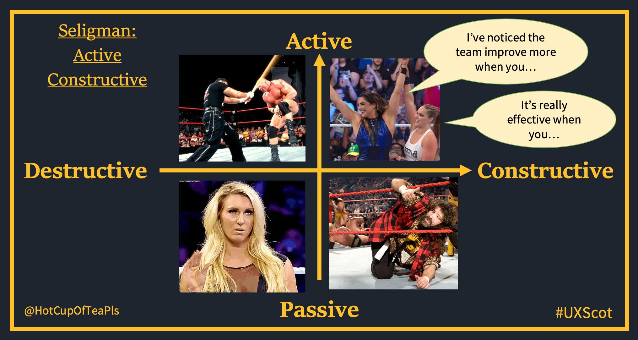
It was one of my favourite sessions, I really enjoyed the sense of humour, the illustrations (a mix of animals, David Hasselhoff and wrestlers) and the content itself.
She started with the famous shit sandwich which she thinks doesn’t work, as it’s like:
- piece of feedback 1: irrelevant
- piece of feedback 2: he hates me!
- pieces of feedback 3: who cares?!
And in the end, the response is an attack and emotional response.
Ceri showed the drama triangle from Karpman, with the 3 actors: the victim, the persecutor and the rescuer. She took us through various models, like Seligman (active/passive, constructive/destructive), radical candor (care personally more or less vs challenge directly more or less).
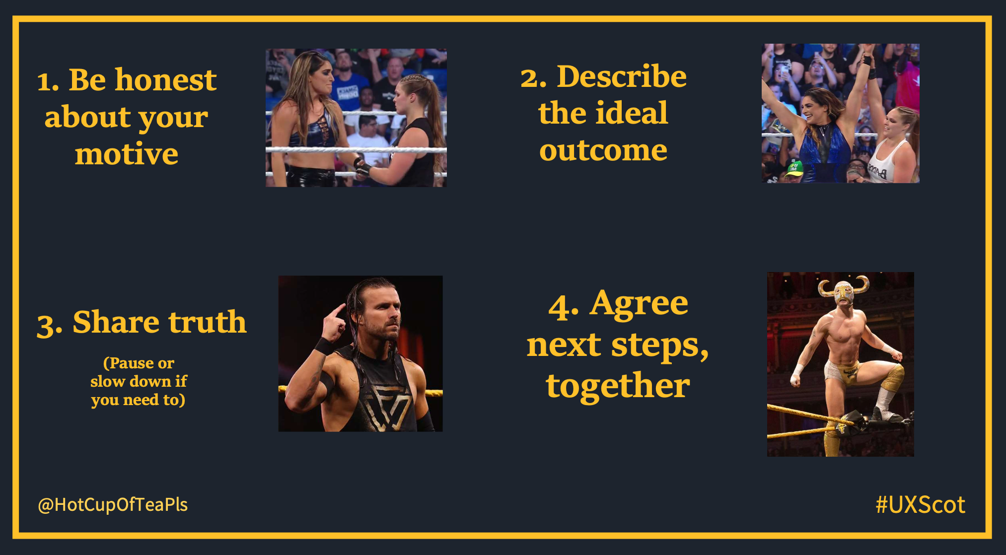
Some of the points she made:
- it’s the environment, the conditions of the conversation that makes it feel unsafe, not the content itself.
- we need to be aware of our own response and other people’s response
- the iceberg representation was put to good use, with the problem outside of the water and the rest of the iceberg under the water being the ‘actual’ problem, when we don’t always have the view point of others and their context
- We need to try to be curious, and treat opinions as valid, and understand the truth of the other person, this gives them a feeling of safety
- understand if the person has a prevention focus (what I want to avoid) or a promotion focus (what I want to get) and speak their language
- you need to look at how YOU contribute to the problem, then other people, then the system around the problem
Connecting the dots
Nice workshop as well run by Jason Bootle: Connecting the dots – measuring the value of service design, using a bit of Liberating Structures, slides were shared so have a look. I’ve really enjoyed the conversations in the room.
One practical tip: if you are going to use the 1-2-4-all Liberating structure, make sure that the acoustic of the room is good because when we had the conversations in pairs, it was so noisy I could hardly hear the person next to me!
If you are curious, I have a blog post about Liberating Structures.
Sessions I missed
Lightning talks
There was a session with lots of lightning talks. I didn’t go as I was resting but it was very good from what I’ve heard. It’s great to create a space for this as it’s a good way for people to have a go at public speaking in a safe space even though it was in the main room, so must have been quite intimidating!
Too many good sessions to go to!
I missed Lauren’s talk: I don’t know what I’m doing and that’s okay: lessons learned as a manager, and Tricia Okin: Get in where you fit in: understanding which teams work for you, both shared their slides so have a look at them.
Also Anne Dhir: The circle of life: lessons learned from killing services and Mandar Tamhane: Running an inclusive hybrid workshop, he shared a blog post about it.
Slides shared I want to go back to
- Roger Attrill: Colour, contrast, & accessibility: not as black & white as it seems
- Gintare Venzlauskaite: The state of privacy UX
- Chris How: Yippee IA – Information architecture for digital designers
- Neil Turner: Continuous discovery – holy grail, or poisoned chalice?
- Kathryn Davies: Questionable Research Confession Booth
- Miriam Vaswani: How to design content for people in crisis
In part 1, I shared my experience as a speaker and reflections about online versus in person conferences.
Slides of my talks: