Service designers often use mappings to communicate about their design. But many people can’t engage easily with a visual, especially a complex map. In this blog post, I explain how to use alternative formats for your mapping to help stakeholders engage with them.
How a service designer can contribute to accessibility
This week I spoke about how a service designer can contribute to accessibility at SDinGOV. It was recorded. You can watch the session on Vimeo. I spoke about:
- how we created a guidance for the service design role in the DWP accessibility manual
- making your service accessible (for your users)
- design communication (with your team and stakeholders)
- design together
The design communication part and the alternative format for mappings in particular, is what most people came to talk to me after the session. An alternative to a visual is essential for people who cannot see, but as it’s often the case with accessibility, it will help many other people who can see but who will prefer to engage with a different format too.
I’ve shared the slides of that talk in various formats if you are interested.
The problem
Hannah Jump has written a good blog post about Why you need to make your maps accessible. Maps can be powerful tools to communicate your design, but some of your stakeholders won’t engage with them.
Some stakeholders might not be familiar with maps
Most designers love visual artefacts. That’s what we do. But when you work with people from Policy or Operations, they are not used to our mappings and might struggle to engage with them. Designers like their maps and to be fair, many ‘non designer stakeholders’ like them too. But complex visuals can also be a blocker to many, in the same way a technical diagram can intimidate non techy people, just like a legal text for people outside of the legal and policy teams.
The amount of information on your map
Maps can quickly become overwhelming, and complex. Think of who is your audience? What do you want to show with your map? This can help you reduce the amount of information on it. If you have different audiences and intents, you might need different mappings of the same thing. It’s more work but you are more likely to reach your communication goal that way.
Housing service example
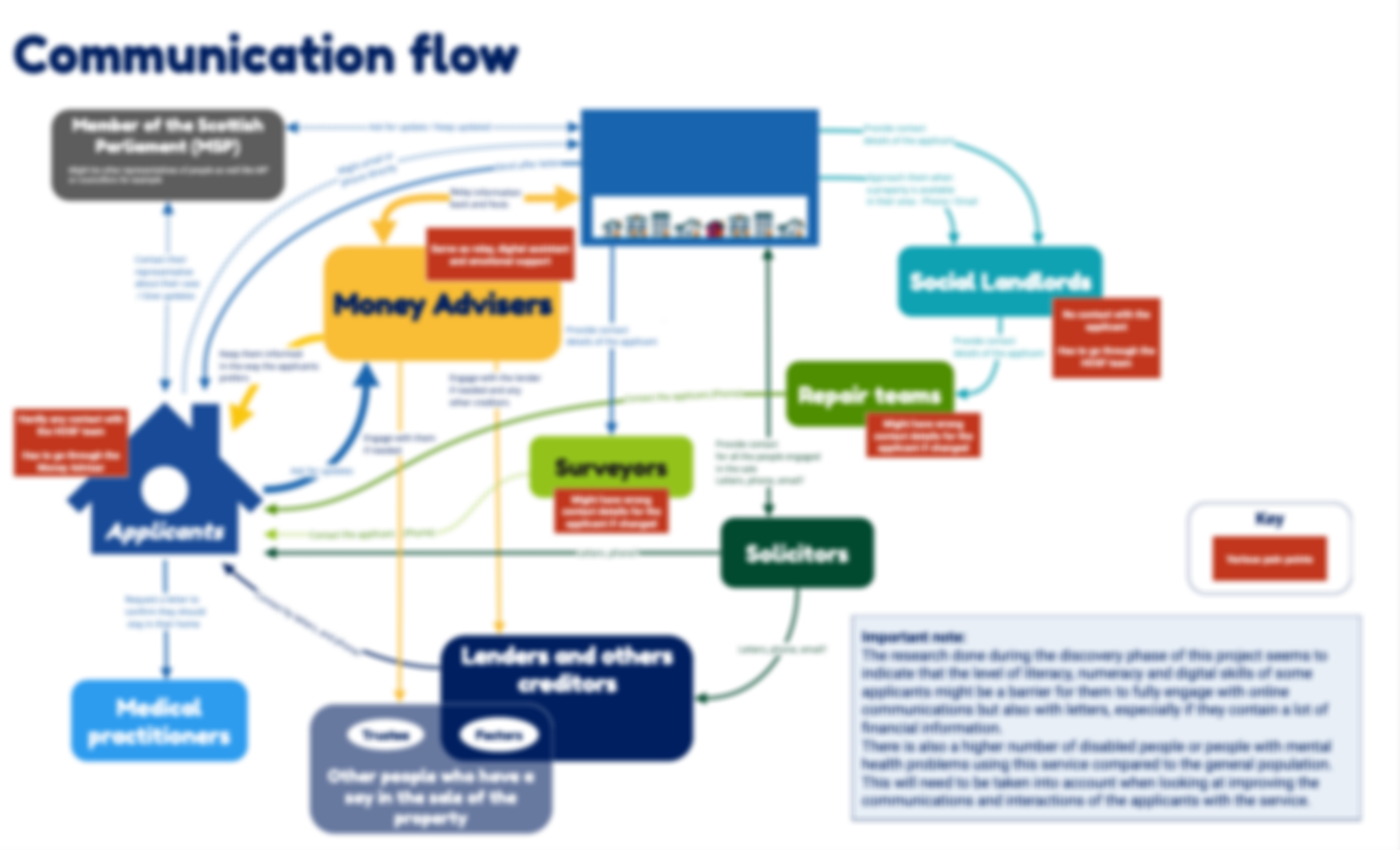
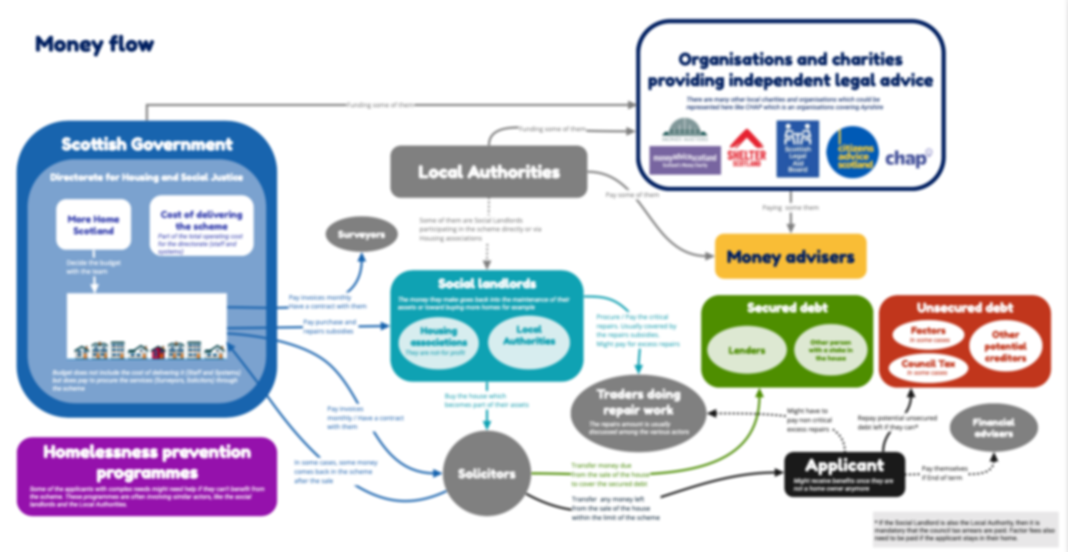
While working on a housing service, I had created an ecosystem and 2 extra maps: one to show how the money was moving across actors, and another to illustrate how comms were flowing and where the pain points were. That way, it was easier to focus on the problems I was highligting instead of showing everything as arrows/relations on the ecosystem which was already quite complex.
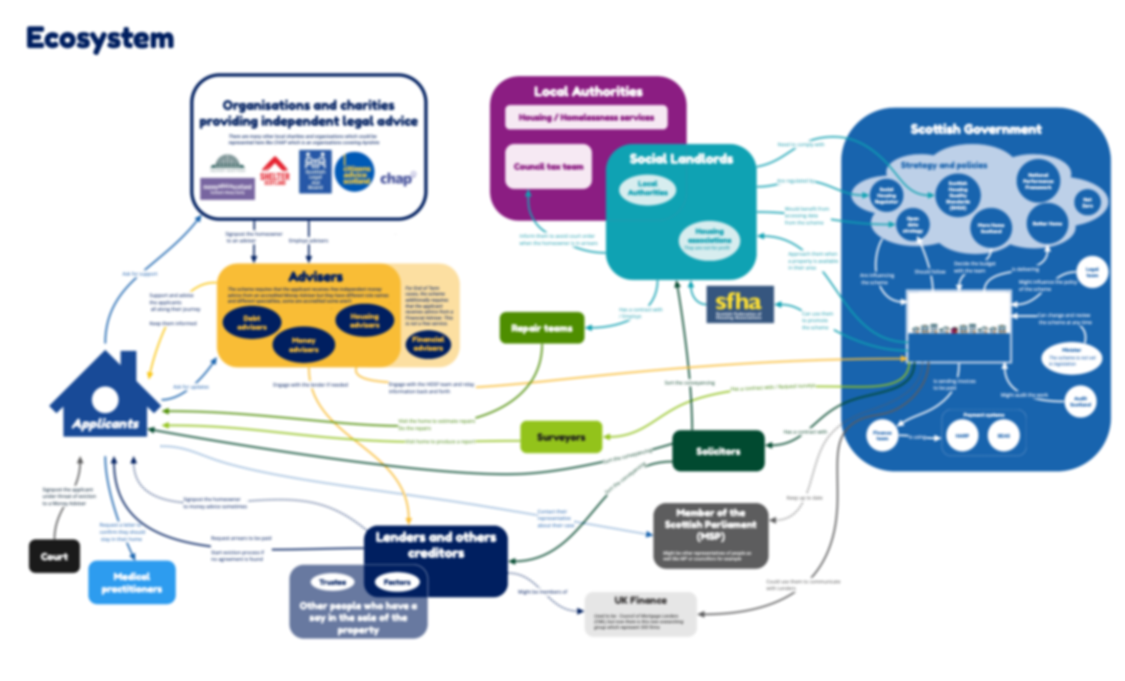
The communication flow map, was showing only the relevant actors of the ecosystem, using the same colours for them, and adding red rectangles text boxes to show the various pain points.
Similarly, a money flow map was created as well, focussing on the relevant actors and adding the secured and unsecured debt elements which were not part of the ecosystem.
General recommendations
For any document you’re creating, not just maps:
- Use legible fonts, and structure your text with the right headings
- check colour contrast especially for your text
- do not rely on colour alone to convey meaning
- use plain language and explain acronyms
- be careful with numbers as many people do not process them easily
- use accessibility checkers for your slides
For your maps:
- colour contrast are still important, and not just for the text, make sure shapes and arrows are also contrasted enough
- legible font is still important, but more flexibility on the size as people can zoom on your map
- beware: people will look for meaning in colours and alignment
- not too much info, not too many colours and shapes
- who is your audience? what’s your intent?
- create alternative formats
What format to use?
As well as creating your map with the right level of details, you need to create an alternative format to the visual for people who cannot see, but also for people who do not process visuals well. Depending on the complexity of your map, your text alternative can be a simple piece of text in an email, or a word document explaining the visual. But if you have a complex map to describe then using a slide deck is a better option.
How to create an alternative
Low level of complexicity
You can create an artefact with both the diagram and its textual description. Keep in mind that most PDF are not working well with screen readers though so you probably want the text description also available as text in a word document for example.
A complex ecosystem
I cannot share actual maps of my work which is why some were blurred in the illustrations I provided. For this example, I’ve recreated one, which do not look that complex but it’s to give you an idea of how to do it. You can access this map as a PDF (30KB)
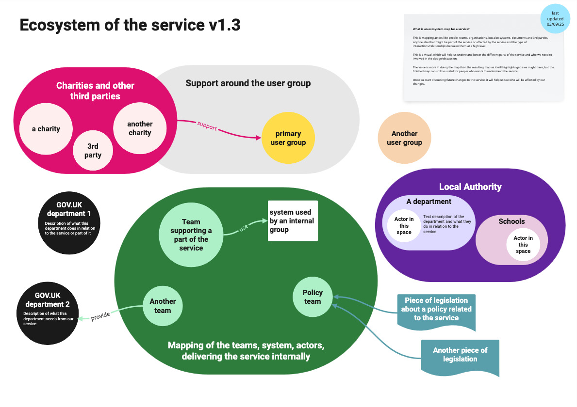
At the top, I usually put a version number for that map. In the top right corner, I explain what an ecosystem is and what we will use this for. I add when it was last updated.
The map itself show the usual elements I have in an ecosystem: The primary group of users, and other groups, potential support around the groups, charities and other 3rd parties. I have some arrows to show the relationships between these groups.
I have a part showing the teams, the systems and actors who are delivering the service internally, and relations they might have with other government departments. Here I’ve put the policy team and relation to piece of legislation the service needs to comply with. Finally in this example, I’ve put a Local Authority part and within it departments with potential actors and what they do.
Once the mapping is in a good place, and I want to start sharing wider, I create an alternative format as a slide deck, and provide the same level of information but easier to use and engage for people who do not function visually or feel it’s too much to take in one go.
Turning the ecosystem map visual into a slide deck
To turn that ecosystem visual into a slide deck, I start with the name of the service or project and give the version number and the last time it was updated on the first slide.
Then I have an ‘educational slide’ where I explain what an ecosystem is. It’s the same as what I had on the visual at the top right. So for example, for an ecosystem, I would say:
“This is mapping actors like people, teams, organisations, but also systems, documents and 3rd parties, or anyone else that might be part of the service or affected by the service and the type of interactions/relationships between them at a high level.”
I explain how to read this map if people are interested in looking at it and I provide a link to the PDF version of the map. I give a small version of the visual. It’s usually not something that can be used as such but it’s reassurance that you are looking at the right document and it might tempt the reader to check the visual if they haven’t already.
This is where the written description part will start:
I start with the users. In a deck I can provide a bit more information and add links. I describe the relationships which are sometimes less obvious in a deck. It might have a bit of duplication compared to a visual as I might have to repeat some of the relationship on various slides.
I usually treat charities and third parties separately, in a dedicated section and again I can explain their role and provide links to information about them.
I have another part to explain the internal aspects of the delivery of the service, and some areas which were a shape on the visual. I might have a few slides here depending on the complexity and number of teams involved in delivering the service.
I often have one about the policy and legal aspects, and links to related legislation when relevant. I have a part on the system and tools, where I explain who uses them. And finally I invite for feedback so I can improve when things were missing, incorrect or confusing.
I get more feedback that way, especially from people in Operations teams, who are usually not familiar with design and maps like that. With this format, they sometime get back to me saying things like:
“It’s quite complete, I’ve never seen the service like that.“
It’s nice when it happens.
Download the text alternative for this ecosystem as a PowerPoint file (250KB)
A service map
I’ve recreated a map. You can download the PDF of the service map example (180KB) if you want.
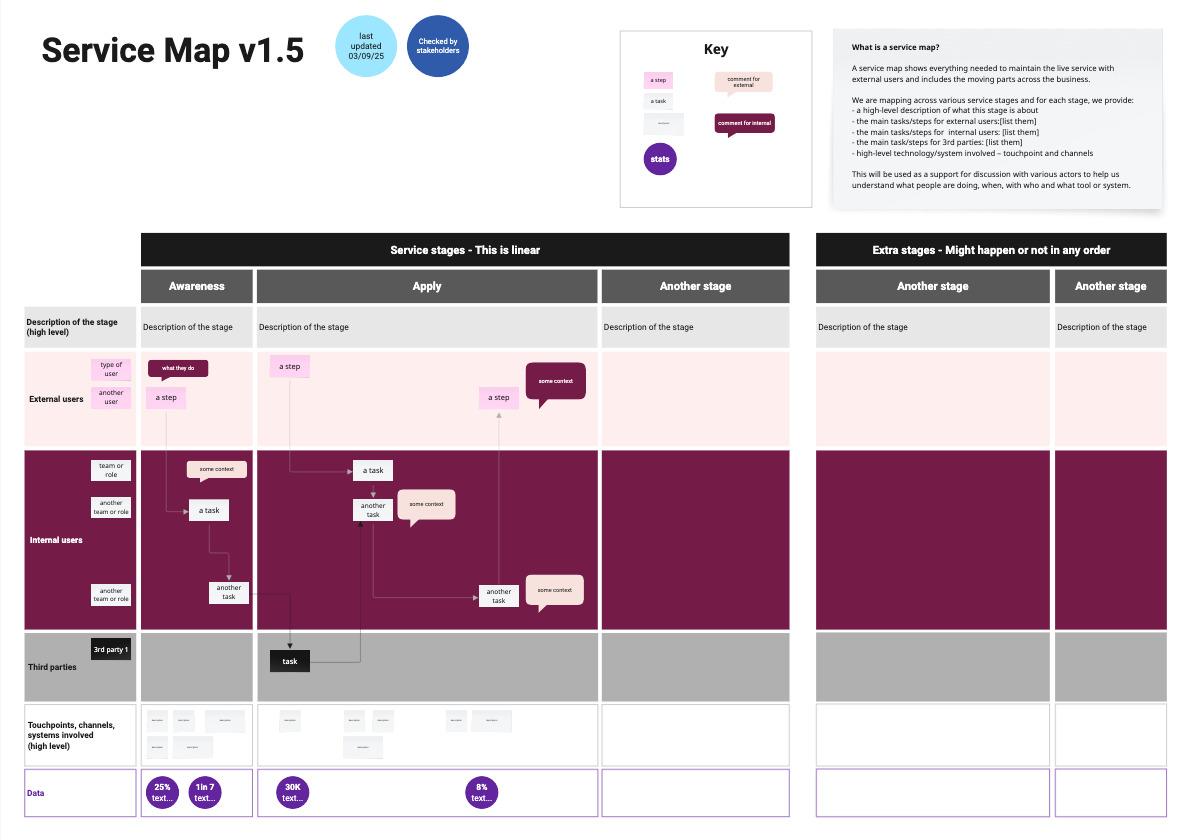
I have a version number. In the top right corner, I explain what a service map is and what we will use this for. I provide a key for the colours and shapes I’m using and say when it was last updated, and if it’s has been checked by stakeholders or not.
The map itself show the usual elements I have in a service map:
The column are each stage of the service, some are linear, here I’ve put awareness, apply, and another stage – And then more stages which might happen or not in any order.
For the rows, I have a first row that describe each stage at a high level, then a row for the external users and sub rows if there are different types, then one for internal users, again I might have different layers for different type of internal actors. I often have an extra row for third parties delivering the service too.
Under this, I have a row for the touchpoints, channels and systems involved at a high level and finally, a row where I add a bit of data when I have it about this specific stage. Across all this, I have boxes explaining tasks, events and arrows connecting them to understand the flow of the steps.
Once the mapping is in a good place, and I want to start sharing wider, I create an alternative format as a slide deck – But this time, I slice the mapping differently.
Turning the service map visual into a slide deck
I have a similar first slide. Then a similar ‘educational slide’ where I explain what a service map is. Again I explain how to read this map. I give a small version of the map. This is where the written description part will start.
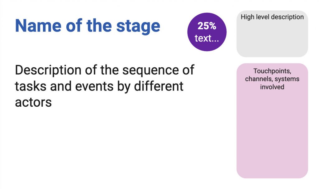
I start with the linear parts of the service. For each stage, I will have a slide – some time more than one – where I provide a description of the sequence of tasks and events by different actors, I’ll add any data I might have about this step. For example the percentage of users failing to provide the evidence we need, I have a part of the slide where I give a high level description of the stage, and another to mention the touchpoints, the channels and systems involved.
I do that for each stage.
Once I’ve described all the stages in the linear part of the service, I have a section for extra stages which might happen or not: it could be about making an appeal to a decision or transferring to another service. Then again I have a slide per stage with the description, data, touchpoints etc…
And finally like for the other map, I always have a slide inviting for feedback and giving a contact to do so.
Download the text alternative for this service map as a PowerPoint file (200KB)