What I took back from it, plus this year: my experience as a volunteer, and lightning talk speaker.
If you can only go to one conference, this is the one to choose
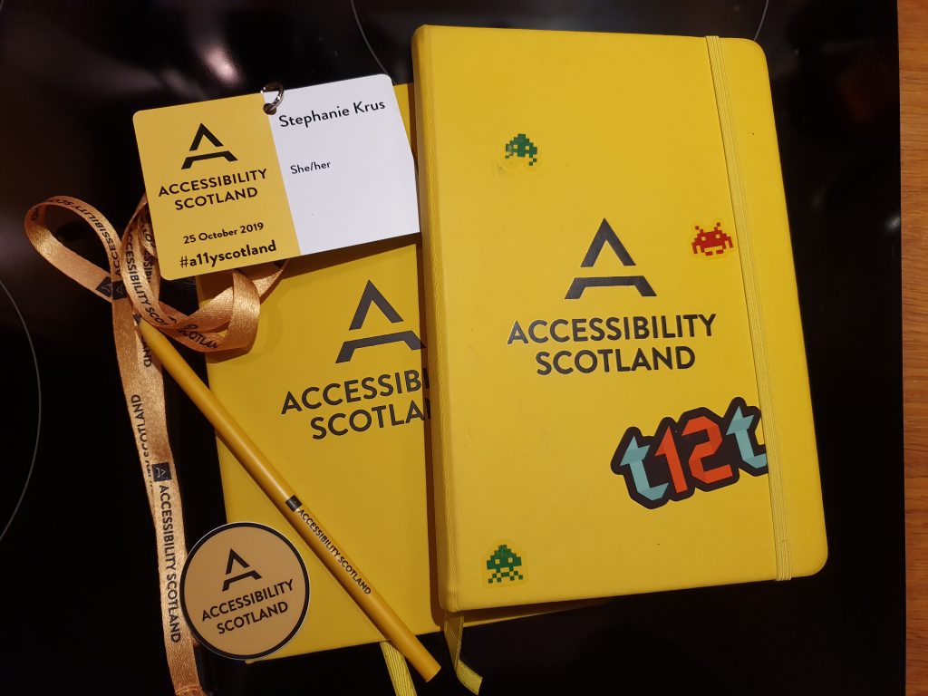
One day of talks with great speakers (single track event so you don’t have to worry about making the wrong choice when picking your talks), fully accessible venue, super friendly, totally affordable. Love the notepad you get.
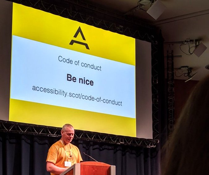
The code of conduct is simple as you can see on the slide behind Kevin White, one of the organisers:
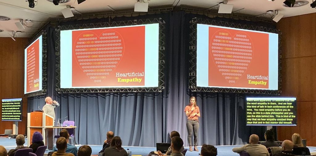
All conferences should have live captions and sign language, it makes a real difference not only to deaf and hard of hearing attendees, but also to people like me who do not have English as their first language. Great to catch up if you didn’t have time to write down a great quote too! This should be the basic expectations of any conference. On top of things this year, the slides of the talks were available on the website prior to the event! So you don’t have to worry about missing a reference, url or quote.
If you don’t want to miss the next conference (and other events they organise during the year), you can join their mailing list, or follow them on twitter @a11yScotland.
The speakers
The videos and transcripts for each talk are available (on 02/02/2020: still missing one).
- Cat Macaulay: Accessible public services – are we there yet?
- Leonie Watson: I, Human (Transcript and video not available yet, but you can download her slides here)
- Ashley Peacock: Design to build bridges when to use disability simulation
- Laura Kalbag: Accessible unethical technology
- Matt May: Design without empathy
Cat Macaulay: Accessible public services — Are we there yet?
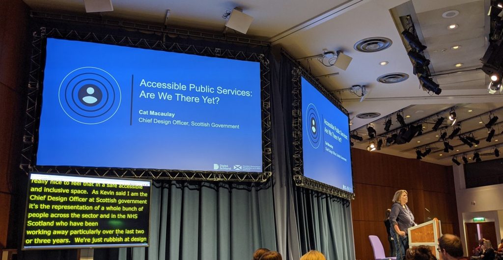
Cat is Chief Design Officer at the Scottish Government.
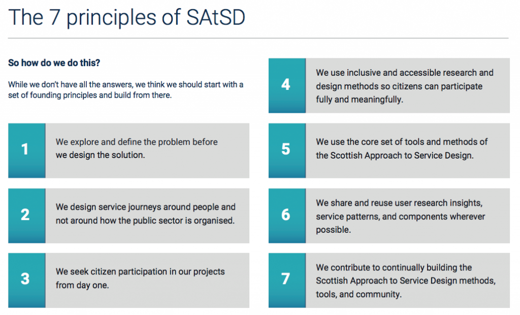
If you are not familiar with the Scottish Approach to Service Design (SAtSD), here are the 7 principles
Design With not For: the experience panel
She explained how the Social Security was using this approach to involve citizens with lived experienced of needing, applying, receiving benefits, or not, in the design of these services. They do that with an Experience panel which they try to have as diverse as possible. You can sign up to take part. You’re then contacted on a regular basis and invited to interviews.
They also work with disabled organisations and community groups to engage as much as they can with a diverse audience.
The Experience panel is involved in the design of the service, but even better, they try to engage earlier: when they design the legislation.
By having citizens coming along and co-design with you, they have a direct involvement in the decision making. It’s more complex then it looks from outside, but it has to be done.
The design itself needs to be inclusive and accessible
Diverse groups of users working with design teams is good, but we also need more diverse methods to get more people into our design teams.
The stereotype is a team in front of a wall of post-its. This is not accessible! We have to redesign the design methods themselves, the tools , so we can get more diverse people in our team.
This is democracy
Democracy is not just about politics and voting . It’s also about how people access local services every day. That’s why citizen participation in the design of these services is so important. The public sector needs to understand that the way we do thing exclude people and we need to change this.
“If one person is left behind in a democracy that’s one too many”
— Cat Macaulay
Cognitively disabled
She illustrated how stress can make you temporary disabled, using the example of a couple, where one became gravely ill. The impact on the other one, the stress, makes them cognitively disabled. In that state, you can’t decide as well as you could before. You struggle. And you don’t have a single need to resolve, you have lots of needs which are going to be delivered by different organisations.
“Applying for PIP was the worst experience of my life… and I’ve worked in war zones…”
— Cat Macaulay
You have a complex journey, lots of needs, lots of organisations to deal with and that system fails people. They fall through the cracks.
We need to design around the users, but at the moment, we design around the public sector, which is complex: there are large organisations, local authorities, third sector, each of them designing a little bit of the service. We need to stop doing this.
Collective sense making
Too often someone do the research and analyse it themselves. This is wrong, we should collectively analyse it. That way people can challenge the analysis early. Doing this collectively and inclusively is hard but it improves the robustness of the insights.
“Design is just a set of techniques to fight the human instinct to dive in and solve other people’s problems.”
— Cat Macaulay
We need to value and respect our differences, to come together and collectively improve the way we design to respect others and live in a fairer way.
Spend time in the first diamond, don’t start after
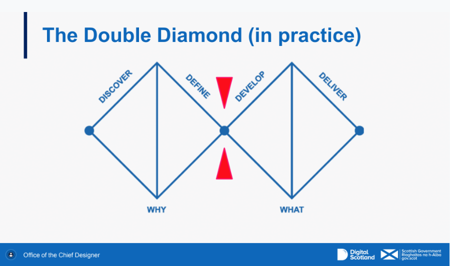
Quite often, design teams don’t spend enough time thinking and defining the problem, they jump right in and work on the solution.
We’re not sure if Albert Einstein said this or not:
“If I had an hour to solve a problem I’d spend 55 minutes thinking about the problem and five minutes thinking about solutions.”
But I’m sure Cat Macaulay did say:
“Spend as long thinking about how to solve the problem and defining it as you do to solve it”
Dignity and respect
We should measure a country, not by its GDP, but by the well being of its people. How they treat them with dignity and respect. That’s what they are trying to do at Social security.
Challenge us so we can do better!
Patterns to use, tools, methodologies
They are working on a minimal viable toolkit to allow collaboration and stop building little bit of services in silos. People don’t always chose not to do the right thing, some times, they just don’t know how.
Léonie Watson: I, Human
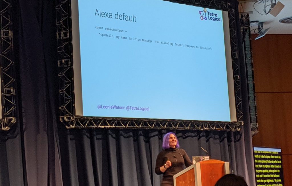
She took us through a journey in time about how we (humans) have tried to create intelligence life: from Frankenstein to Asimov 3 laws which seemed at the time the only logical way to interact with a robot. But humans are not rational!
- First law: A robot may not injure a human being or, through inaction, allow a human being to come to harm (she used this one to talk about image recognition)
- Second law: A robot must obey orders given it by human beings except where such orders would conflict with the First Law (this one for speech recognition and text to speech as this is where we need to communicate with them)
- Third law: A robot must protect its own existence as long as such protection does not conflict with the First or Second Law (this one for AI)
Image recognition
Complex things are simple to do. It’s the simple things that a computer struggles to recognise:

As a human, it’s easy for us to identify these as chairs (well maybe the third one would take a bit of time) but for a computer, this is complex.
Humans tend to do the most ridiculous things with very expensive technologies
Like making a computer sing:
But there are some interesting attempts like Voder in 1939 which was quite good for the time:
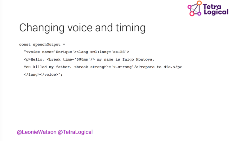
Nowadays you can make your Alexa say your favourite Princess Bride quote quite well using SSML (Speech Synthesis Markup Language)
Artificial Intelligence (AI)
Essentially, AI is still human intelligence. So it depends on our design, and the data we provide.
Well worth following Léonie on Twitter
Ashley Peacock: Design to build bridges, when to use disability simulation
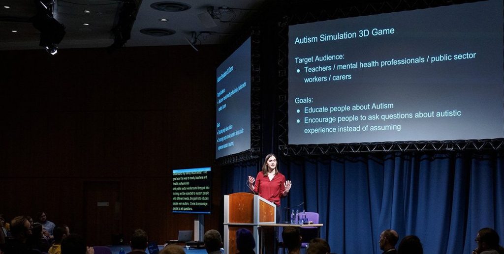
They develop websites and app for people who experience differently from the norm (neurological differences, cognitives impairments and disabilities)
Because no one size fits all, she told us of 3 different approaches they used while researching with users.
And in all of them, they have tried to design their approach with the users themselves, which is very much in line with the first talk from Cat Macaulay.
Autism Simulation 3D game
She explained how she initially struggle with the interviews.
“If you asked black and white questions, you’re going to get black and white answers”
— Ashley Peacock
People tends to give you the answer they think you want to hear. so instead of asking: “What’s your daily routine?”, she asked: “tell me what it means to have a successful day? What does an unsuccessful look like?” and she asked autistic people to write the questions.
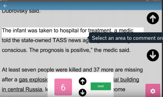
She received much richer answers this way. They developed a simulation game to show what 3 basics morning tasks could mean when you are hyper sensitive to noise, sounds and smells. And they have let the users create their own experiences, and iterated with them. The video below is the result.
Public transport assistant
The idea was to design an application for people with dementia, or visual impairment, deaf, or wheelchair users. For this one, the preferred approach was to shadow the user in real life situation, with the user speaking through it. It was much richer than an interview would have been. They could ask questions about the experience in the moment and could discover some issues as they happened that a user might not have thought of mentioning during an interview.
But it’s hard to reuse as they did the shadowing in London and in comparison to other UK places, London is very accessible.
Read Clear!
This one was about creating a reading tool for people with a quite rare condition: Posterior Cortical Atrophy. They develop difficulties with visual tasks such as reading a line of text, judging distances, distinguishing between moving objects and stationary objects, or inability to perceive more than one object at a time.
They have conflicting requirements, as they need smaller texts, but they can potentially be short sighted too. This time shadowing would not help as much so they asked the user to do a diagram showing how they wanted a text to be presented. And as the needs were very different from one user to the other, they made the interface as adaptable as possible.
Just like Cat Macaulay, she advocates for users to be involved as early as possible, as they are the experts. You help them design what they need.
Matt May: Designing without empathy
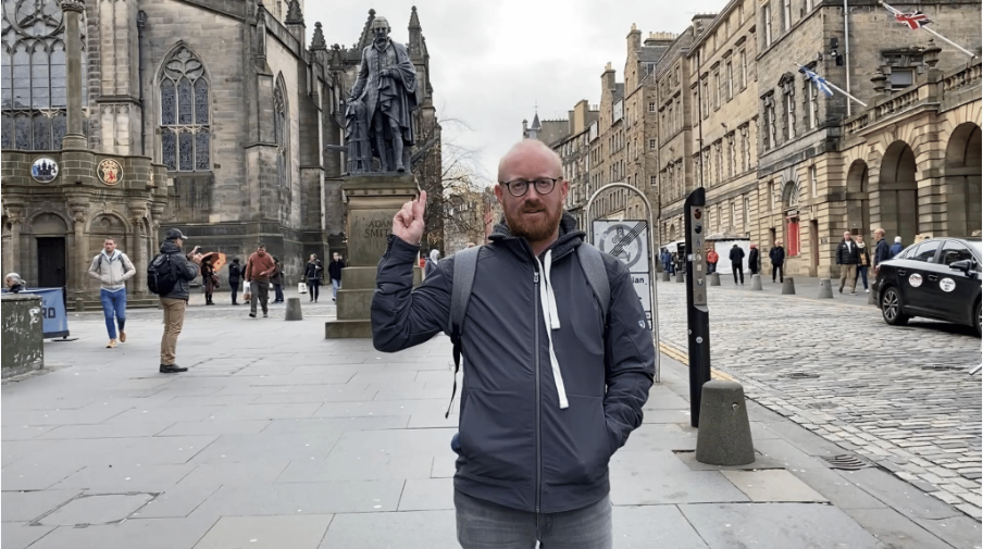
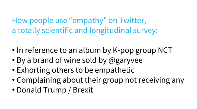
This talk was very different from the others and made the audience laugh quite often. But many were also a bit taken aback as empathy is usually highly recommended in Design so this talk made everyone rethink the notion.
Feeling something is not the same as knowing something.
For him, the way we talk about empathy and do it is bad.
He explained that it’s empathy done wrong that you need to get rid of. With a detour via Buddhism, he suggested replacing empathy by:
- compassion
- professionalism
- authority
- equity
He also talked about simulating disabilities. Quite often, the reaction you get after the simulation is: “thanks god it’s not me!” and they feel more pity for the person living permanently with the issue which is definitely not the reaction you want.
Simulation should only be done in a very narrow band and should be led by someone who has the issue.
Laura Kalbag: Accessible unethical technology
This was the last talk and quite a rich one! so much to take in: 230 slides!
You can access them, along with lots of links and resources here.
I’m still digesting all this ahahaha! but this is really worth reading so do take the time to go through it.
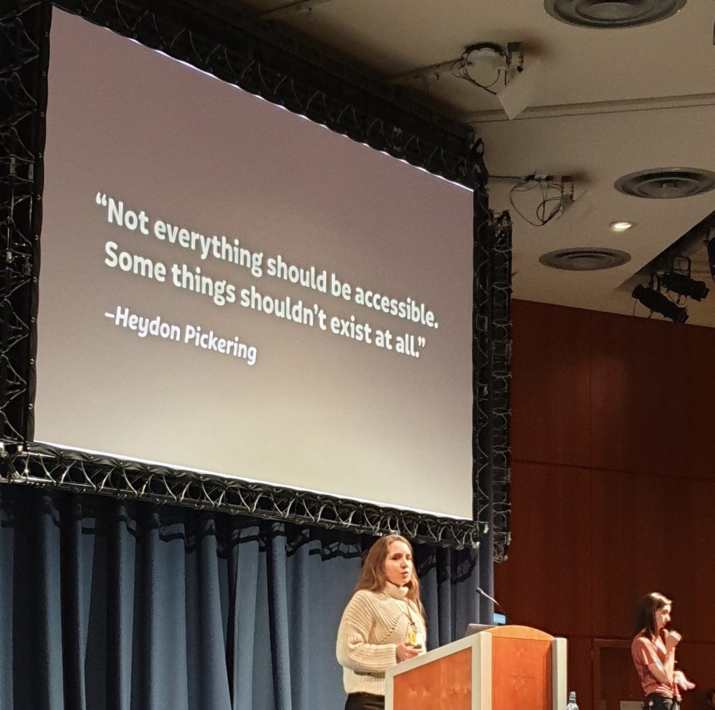
She started with this quote from Heydon Pickering:
Not everything should be accessible. Some things should not exist at all.
– Heydon Pickering
She talked about trackers on internet, what it is and how to block them.
Some of her advice:
- avoid logging in (if you can)
- avoid providing your real name
- use custom email addresses
- avoid providing your phone number
- use a reputable VPN (Virtual Private Network) — but sometime they track you too!
- use private browsing
- log out
- disallow third-party cookies
- use a tracker blocker
- use DuckDuckGo for search (now Google)
- don’t use Gmail or WhatsApp or Facebook
- seek alternatives
But it’s not always easy, for some people, the social media are a very important part of their life:
The missing link: why disabled people can’t afford to #DeleteFacebook – The Guardian, Frances Ryan
“It’s hard to advocate for change when alternatives don’t yet exist”
— Laura Kalbag
She finished by providing advice on how to build alternatives ethically and changing behaviours:
Be independent, the advisor, the advocate, the questioner, the gatekeeper, be difficult, be the supporter.
Again, take the time to go through the slides and links she mentions, it’s worth it.
Volunteering
Last year, this was my first ever conference, and this year it was the first time I volunteered at one. You get to wear a beautiful mustard teeshirt and do things like set the goodies on the tables, pass the microphone to attendees if they have questions after a talk. I was at the entry scanning tickets, and giving name badges and lanyards. I really recommend it: it’s nice to be part of the event that way and I still got to catch up with friends and take lots of notes.
Lightning talks
Last year, one of the sessions was workshops you could vote for in the morning. This year they changed this to lightnings talks and this was organised by Girl Geek Scotland: attendees were to submit an idea of a talk (max 5 min) they would want to give prior to the event, vote for the top 6 on the day and people could chose which one to attend over lunch time. But only 5 people submitted one. So no vote required. I had submitted a talk so was automatically selected.
One of the talk was from Peter Aitken, about Global diversity CFP day. The website is here.
Another was from Andy Ronksley, he is working on his slides and will share them soon. His talk was about inverted pictures, SVG and background.

I don’t have the name of the last speaker and the title of his talk — sorry.
My talk was about invisible disabilities. 5 minutes go really fast. The good thing is, if you’re not too sure about giving a talk, then this is only 5 awkward minutes. Easily forgotten by everyone after ahahaha.
I never thought I would make my first talk wearing a yellow teeshirt, scrolling through a PDF in 5 minutes but life is full of surprises! Some people came to tell me they learned from it, so I’m glad it was 5 minutes well spent for them.
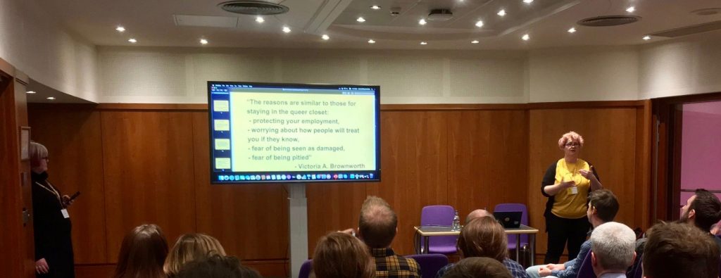
A longer version of the talk is in this blog post.
Sorry this write up is longer than usual, but it was such a dense conference! I hope this was useful to you.

