Well, if you are asking, it probably isn’t. Accessibility is usually not that hard to achieve but you must have this in mind while creating your website, not as an after thought.
This post is for people who are new to digital accessibility and want to learn how to improve it.
In this post
- what digital accessibility is
- how people use websites
- quick checks
- common issues
- how to fix the problems
- how to get better at this and learn
What digital accessibility is
Digital accessibility is the ability of a website, mobile application or electronic document to be easily navigated and understood by a wide range of users, including those with visual, auditory, motor or cognitive impairments.
The concept of accessibility doesn’t just apply to disabled people – all users will have different needs at different times and in different circumstances.
It can, and it will affect everyone at some point in life.
How people use websites
People might use your website in a way you did not expect.
For example:
- a dyslexic person might use a screen reader even though they can see
- someone with a motor impairment might be using a switch or their voice to interact instead of a keyboard, or a mouse
- some might change the colours of your website because clear text on dark background works better for them (dyslexia, migraine, light sensitivity)
- scrolling or motion might make a person physically sick (vestibular issues)
- a person with a low vision might be zooming to see or use a large mouse pointer. They might need to scroll horizontally as well as vertically
Worth keeping in mind as well that some will only have a mobile phone to use internet, or have an old laptop with a small screen or a slow internet connexion.
Quick checks
There are a few things you can try:
- Can you still use your website on a tablet or a phone with a small screen?
- zoom up to 400%, try to navigate your website
- don’t use your mouse and navigate your website using the Tab key to move forward, shift + Tab key to move backward and Enter to select something
- play with your device settings and make all the colours a greyscale, can you read all texts, understand the importance of some buttons, menus and do you notice warnings, errors messages and links?
- mute your device, can you still understand what is going on?
You can also try to use a screen reader on your phone, check the accessibility settings:
- VoiceOver (for Apple devices – it’s built in)
- Voice Assistant (for Android devices – built in as well)
By now, you probably have a list of problems you didn’t realise you had before.
Chrome devtools
There are some automatic tools which can give you a rough idea of some of the problems you have. Like any automatic testing tool, this is only a quick audit and won’t reveal all the problems. A good score, especially for accessibility doesn’t mean you’re doing great for sure as some problems might not come up. It’s always better to test with people.
If you are using Google Chrome for your browser, you can check your website, page by page:
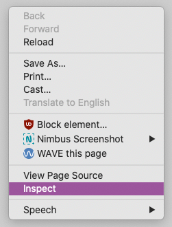
From one page, right click and select ‘Inspect’.
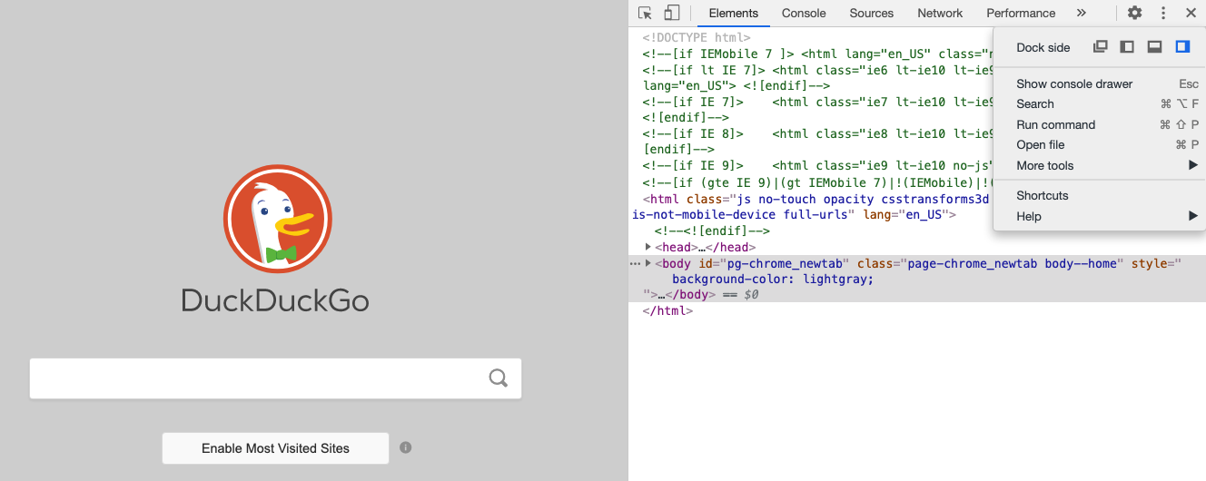
This should open the ‘Dock’ in a column on the right of your screen. You can change this if you want to have it on the left or at the bottom of the screen, using the 3 vertical dots menus and changing the Dock side
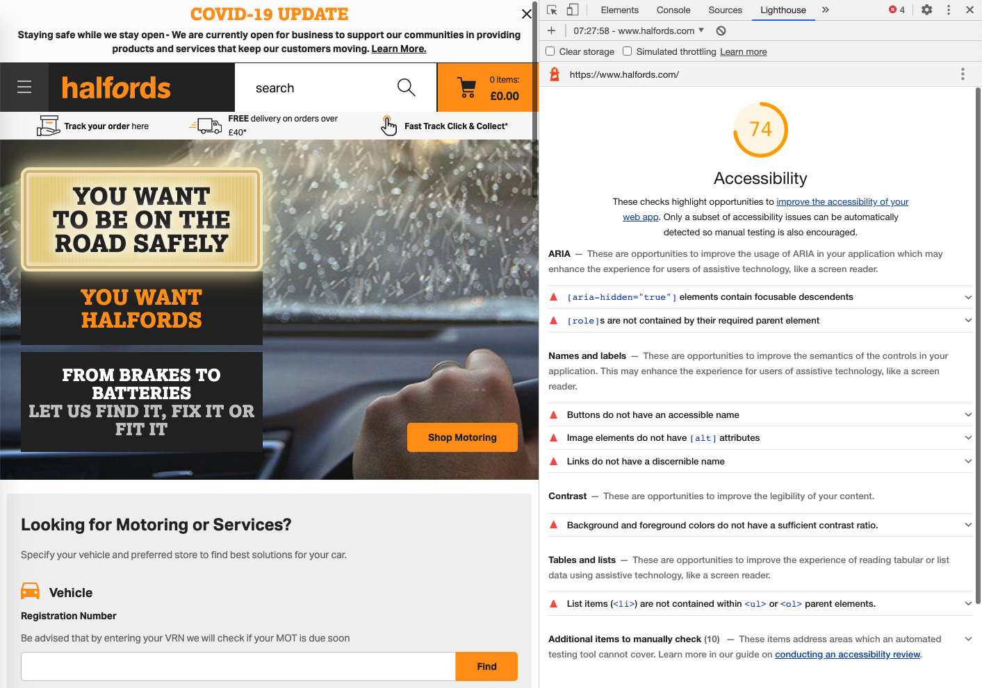
Look for ‘Lighthouse‘ in the top menus, you might have to select >> to see it. Select it and you should see this menu:
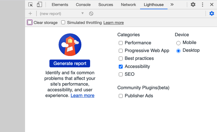
You can select Desktop or mobile on the right and then select as many categories as you want. Here I’m only talking about Accessibility so only selected this one.
Select: “Generate report“. At the time of writing, trying this on the Halford homepage returns a score of 74 out 100 and a list of issues like alternative text for images missing, poor contrast and more.
If you have many pages on your website, instead of testing them one by one, you can try this accessibility checker from Experte.com which will scan all the pages of your website in one go, gives a score and provides a report similar to lighthouse for each page.
Plugins you can use
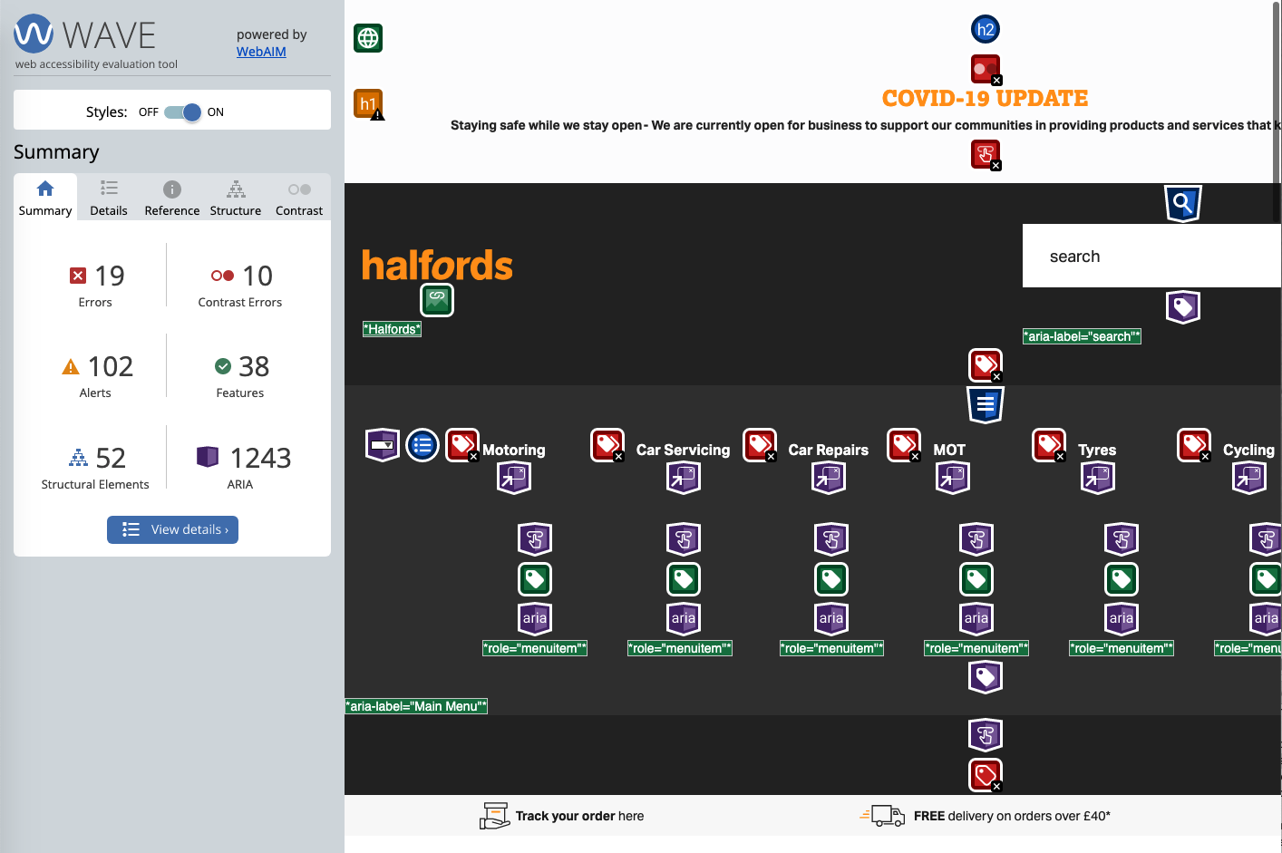
There are a lot of plugins you can add to your browser which will check your website for you. Wave is often used and will show you some issues to solve as well, like headings structure. You can learn more about this plugin here.
Below is how it looks for the same homepage for Halford.
Common issues
- using text in all caps
- poor contrast
- images don’t have an alternative text
- there is text on pictures
- fancy fonts or extra spacing between characters
- text is justified or centred
- media files are not accessible
- motion and animation
- images and icons are pixelated once magnified
- side buttons or navigation bar take too much space once magnified
- the structure of your page makes no sense when using a screen reader
We will see each point in details with some examples.
Using text in all caps
This is very commonly used for button text and some headings. You should avoid it as it’s harder to read for everyone and for dyslexic people in particular.
THIS IS HARDER TO READ BECAUSE YOU LOSE THE SHAPE OF THE WORDS.
This is easier to read because you can see the shape of the words to read quicker.
Poor contrast
Buttons, texts, icons need to be contrasted enough or people might struggle to read them or even spot them. This will affect people with low vision, colour blind people but also anyone using their device when the lightning is too bright or too dark potentially.
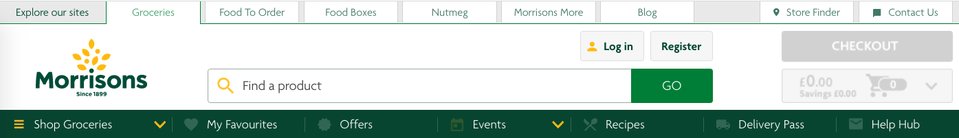
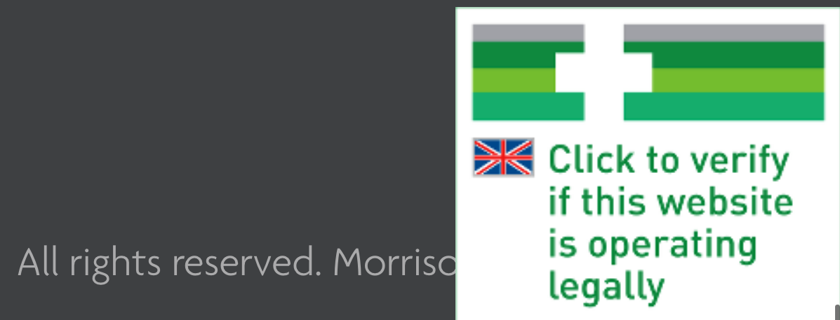
In the screenshot below, from the Morrisons homepage, the icons are very hard to see and the checkout button is very faint. It’s because it’s disabled at the moment as the basket is empty, but still not great as people might try to read it.
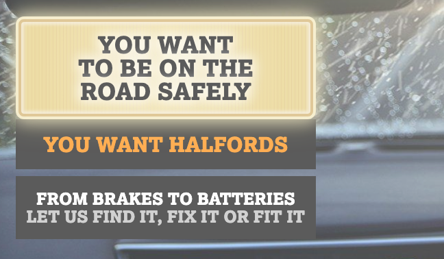
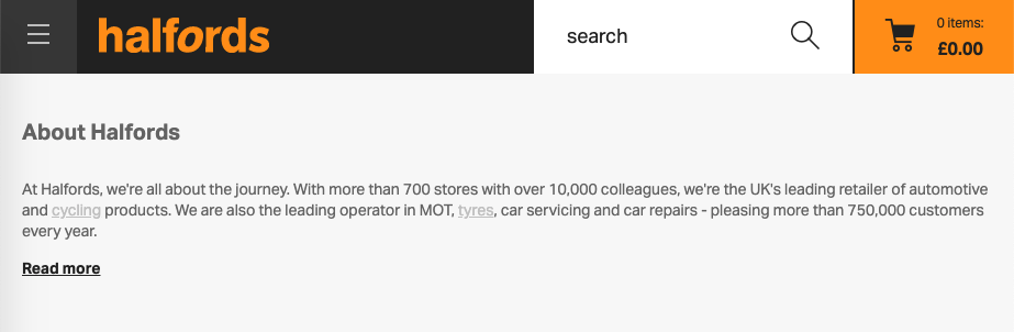
On the Halford page again, can you see the link in the text for ‘cycling’ and ‘tyres’?
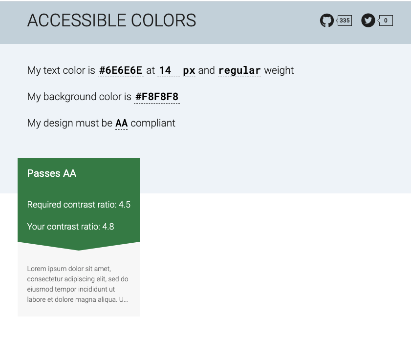
You can test your contrast with various online tools, like accessible-colors.com for example. You usually enter the colour code of the text and the background and it will return the contrast ratio. Ideally, you want everything to be AA compliant but you might as well aim to be AAA compliant which is even better. This is an accessibility standard, set by WCAG (Web Content Accessibility Guidelines).
Using this tool with the Halfords page, you can see that the text in the paragraph passes the AA standard.
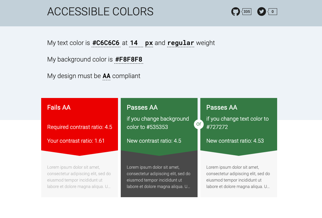
Now using the same tool, but entering the colour of the link text, you can see it fails. The tool gives you suggestions to fix this with a different background or text colour.
Make sure you also test in dark mode if you have one on your website. Also test buttons and links on hover (= when you move your mouse over them).
Images don’t have an alternative text
This is a big one. A lot of people still think that blind people don’t use websites but they do.
All your pictures (including diagrams) should have an Alt text (= alternative text) which will be read by a screen reader for users who can’t see them unless they are purely decorative. In that case you should set the all text to “” which will make the screen reader ignore this image otherwise the user will hear ‘image’ and will think they are missing out.
This is also good for your SEO (Search Engine Optimisation)
A good link to understand more about alt text and how to do a good one. And a longer guidance.
There is text on pictures
This is pretty common and make the text hard to read.
Below is an illustration of bad practice, the text is in white against a clear area of a photo, it’s really small as well. You might remember the first point about avoiding all caps text, so a lot of things to correct here.
One way to fix this is to add a background to the text area, it’s not as nice from an aesthetic point of view but at least you can read the text and spot the button now. I have also made the text bigger and removed the all caps for the text in this area.
A trade off you can sometime make is a slightly transparent background as below.
Fancy fonts or extra spacing between characters
Some websites using fancy fonts for branding and aesthetic reasons. This makes it harder to read for some people. This example below is also using all caps and contrast of one of the sentence is poor.
Extra spacing between characters like for this sentence is harder to read.
Reducing spacing between characters like for this sentence is problematic too.
Italics text should be avoided as well.
Text is justified or centred
Justified text will introduce extra spacing between words which again is harder to read.
Text should be left-aligned, as some people struggle to find the start of the text otherwise and people who magnify their text (= zoom) might completely miss it if it’s further on the right.
Media files are not accessible
You need to provide an alternative for people who can’t hear or see.
Videos with audio require captions synchronised with the audio track. Everything said in the video should be included in the captions. It should include names, sounds and descriptions.
2 types of captions:
- Open caption: is embedded into the video itself, and cannot be turned off
- Closed captioning: can be turned on and off
Auto-generated captions are better than nothing but usually not great: Often inaccurate, especially if the speaker has an accent or when captioning names (people, brand, places etc…)
This will also be used by many people who are not native speakers, or are in a noisy environment or don’t want others to hear what they are watching for example.
This video of a TED talk by Svetlana Kouznetsova is worth a watch to learn more:
Ideally, provide a transcript of your media, so users can either read it or use a screen reader to hear it.
- allow users to scan the content and see if they want to engage with it
- can be searched by people and search engines so better for SEO
Audio descriptions speak out what is happening in the video so that it’s accessible to people with low vision. There are two ways to create audio descriptions:
- a narrator describes all the visual information
- add a separate audio track that describes the visual information
Motion and animation
Motion and animation can make people physically sick. Always warned people and offer a way to stop it. You can learn more about this in this article on vestibular disorder.
Images and icons are pixelated once magnified
Use good quality images and prefer SVG files for your images, including logos and icons. This is a format of pictures which will stay clear if you magnify your screen ( = using the Zoom functionality).
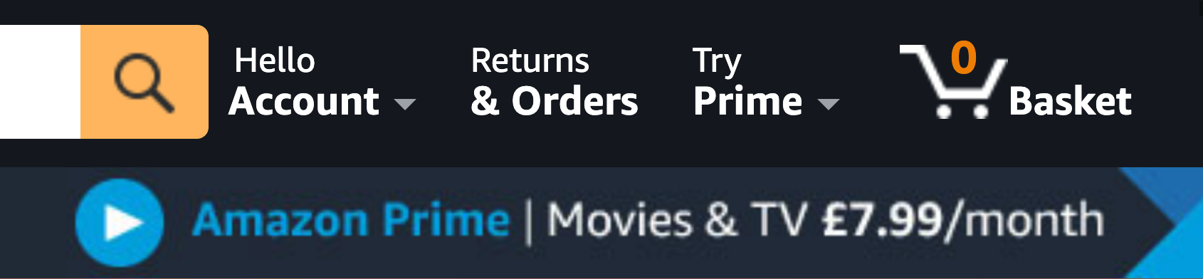
Never use an image of text like below on the Amazon website when you zoom to 400%.
Side buttons or navigation bar take too much space once magnified
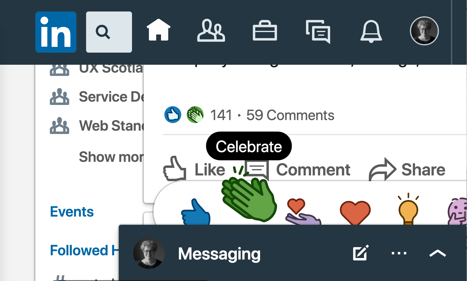
Once your screen is magnified up to 400% on LinkedIn as the top menu and the messaging menu are sticky (not disappearing when you scroll) there is very little space in between to read posts.
Some buttons on the side might also get in the way on some websites.
The structure of your page makes no sense when using a screen reader
Headings communicate the organisation of a page. Screen readers will pick up your structure and a lot of screen readers users are using this to create a mental image of your page. Headings are ranked from H1, the most important, to H6 the least.
- each page should have one H1 which contains the most important information
- headings should separate content into meaningful sections
- don’t use bold, italicise, underline or bigger font only in your style to define sections, as screen reader would not know it’s a heading
- don’t skip headings, for example having an H4 following an H2
How to fix the problems
Some of these issues are easy to fix: style, colour contrast, alt text for your photos, font choice for example. But it might be harder depending how your website was built initially, if you have some developers in house or if you are using a CMS (Content Management System). How much access do you have to make changes if an agency built the website for you?
This is why it’s always easier to build a website with accessibility in mind instead of trying to fix the issues once the website is already built.
Sadly, accessibility is still not a priority for a lot of people.
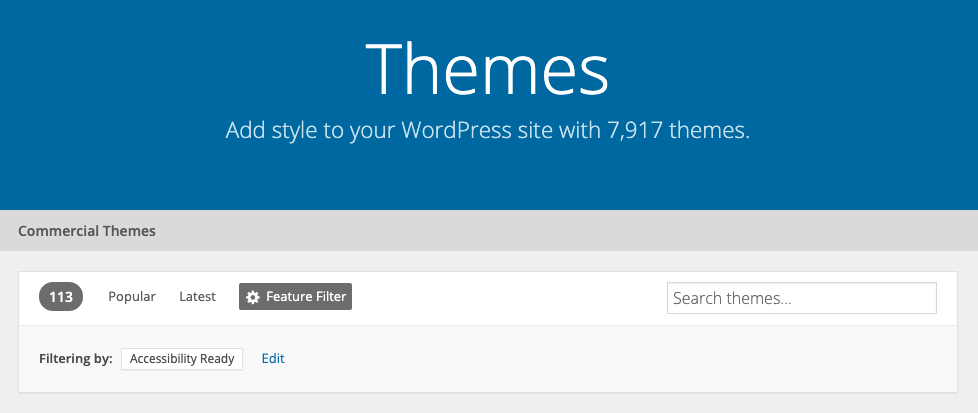
When you create a website using WordPress for example, you start by selecting a theme. This will be the frame of what you can do, with some things you can customise and others that are already done for you.
At the time of writing, there are 7,917 themes to chose from, only 113 of them are ‘Accessibility ready’ (less than 2%). This doesn’t even guaranty that your website will be accessible if you use them, but if you don’t, then it’s very likely that your website won’t be accessible.
If you have already found a lot of issues you are unsure you can fix yourself, then you probably need some professional help to do it. It might be some accessibility training for your developers/designers, or getting advice from an accessibility expert to review your website with you.
It might be a good time to re-do your whole website with clear accessibility requirements in mind right from the start? This could potentially be quicker depending how your current website was made and how much control you have on the code.
Edit 20/10/2024: Please stay clear from accessibility overlays as a way to fix the accessibility of your website. Despite their promises, it won’t help and might actually even make it worse. This post will give you plenty of reasons why it’s not a solution: Overlay Fact Sheet.
How to get better at this and learn
If you are a company: have a diverse team and hire disabled people. Invite feedback from your audience. Get your site tested and if you ask disabled people to test your website then pay them for their work.
If you are on social media, follow and connect with diverse people and learn from them. You can also follow accessibility advocates who will relay some advice and sources to learn more.
And make sure your social media are accessible! This is an easy place to start.
Two recent online events could be a good place to start as well: this one below organised by Accessibility Manchester: Real World Accessibility Stories and 24hours of video about accessibility by ID24.
This post was written after a friend asked me if their company website was accessible. I thought a lot of people might be wondering the same and not knowing where to start.
I hope this was useful.
If you think something is missing or incorrect, please get in touch. I have a keen interest in Accessibility but I’m not an expert.